


Standards Design Group wanted a clean and classy logo that reflected the technology behind their window glass software. Their old logo carried a nostalgic weight, but didn't have the brand look they needed to continue growing well into the future. The new logomark features a striking teal and blue color combination that hints at window glass and wind. Paired with a minimal, yet modern typeface the overall effect is one of a cutting edge company.
SDG Logo
We need a subheader here for the layout to work, otherwise I can try to change some things so it isn't necessary
BEFORE

AFTER


Options aplenty
Armed with notes from conversations, benchmarks, and industry inspiration, Lauren embarked on a journey of concept creation. Only the strongest and most promising concepts survive the initial internal review before being arranged and numbered for a live (screenshare) reveal with the client. Can you guess which initial concept they chose?
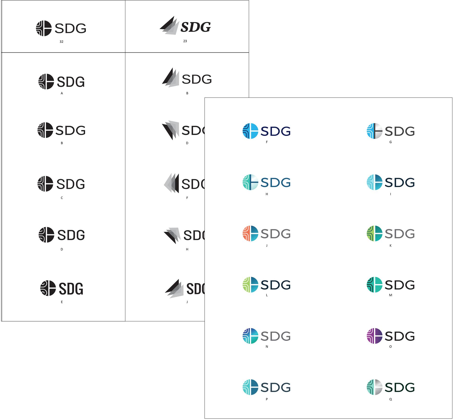
The finalists
SDG considered all the options carefully and also gathered input from trusted colleages. In the end, there were two directions they felt stood out. Lauren worked on variations of both and also applied color to help SDG in their decision. While we typically don't apply color until the logo design is final, in this case we all agreed that color was necessary to determine the best brand approach.

Crisp & Clean
Once the "wind and window" logo design was chosen, the real fun began! Lauren experimented with a range of color and line thicknesses to create the perfect combination of abstract and reality. We all agreed the shiny, grayscale "windows" were too literal as was the baby blue "sky"—the right choice was then made clear. Did you choose the same color combination as SDG? Read on to find out!
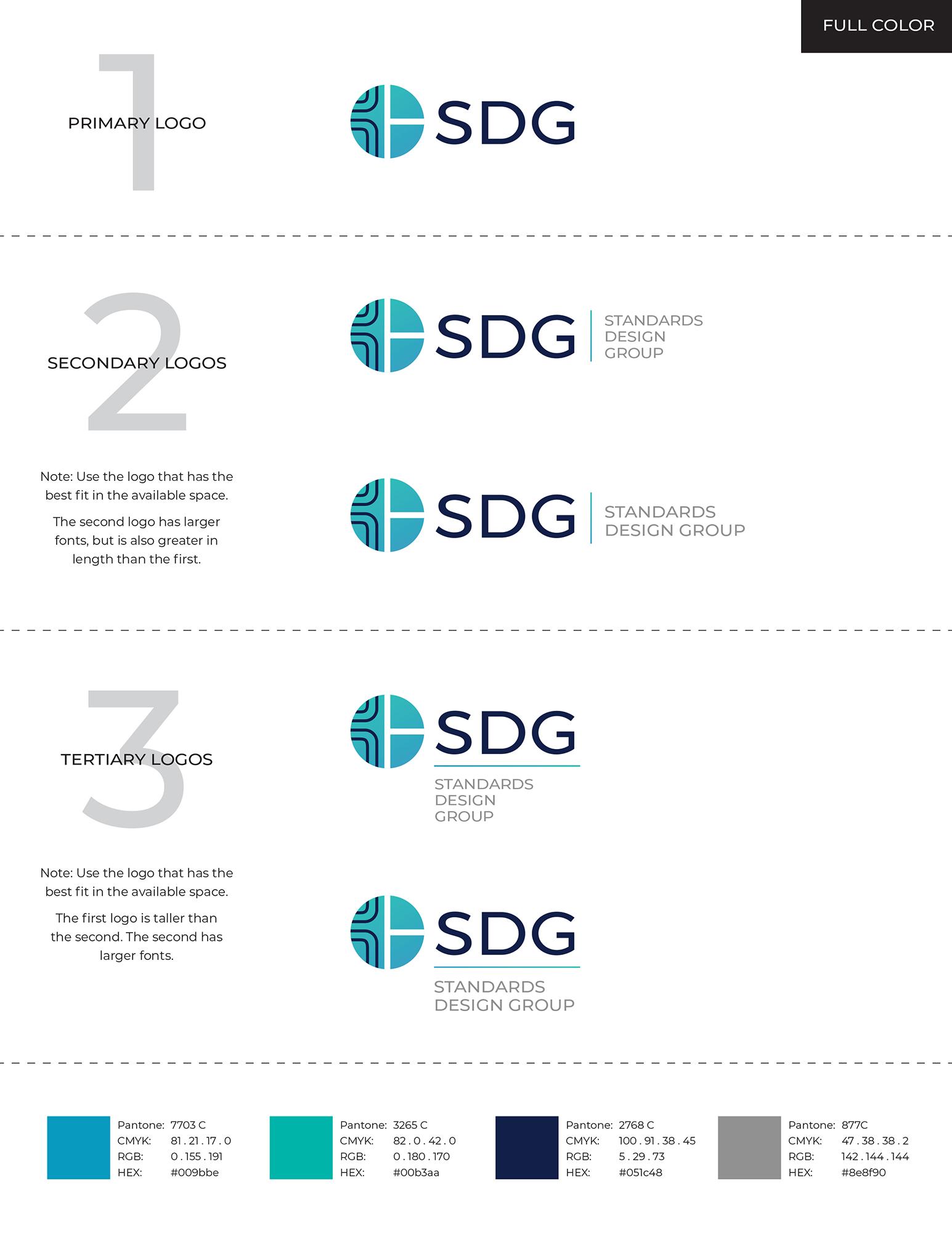
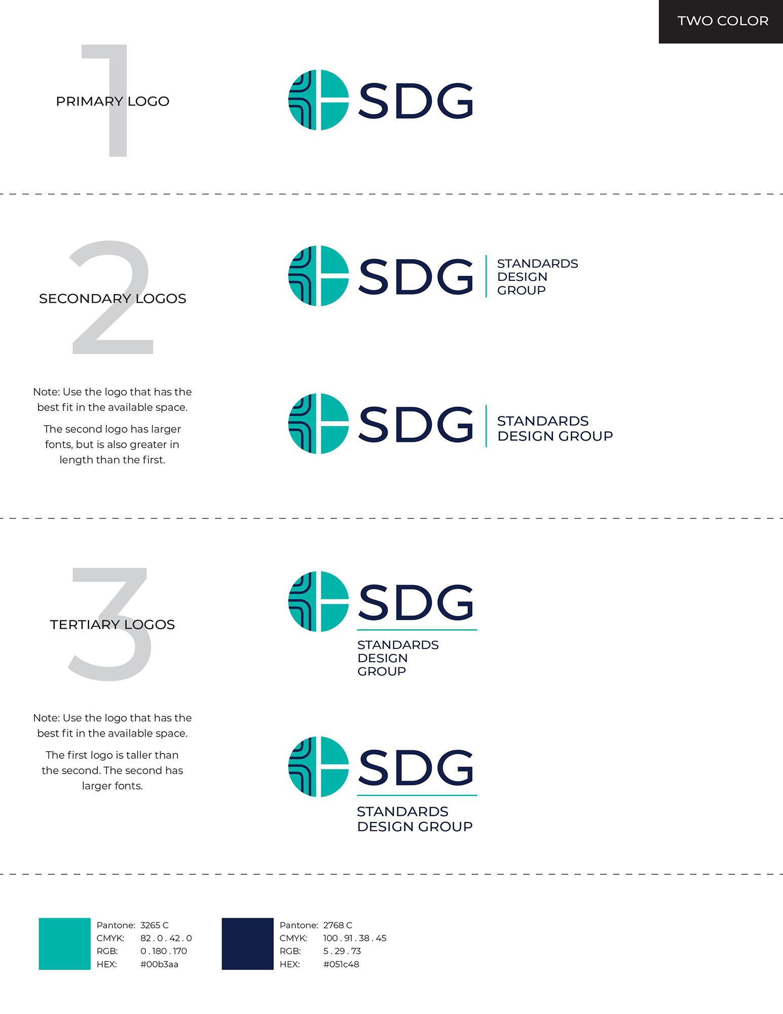
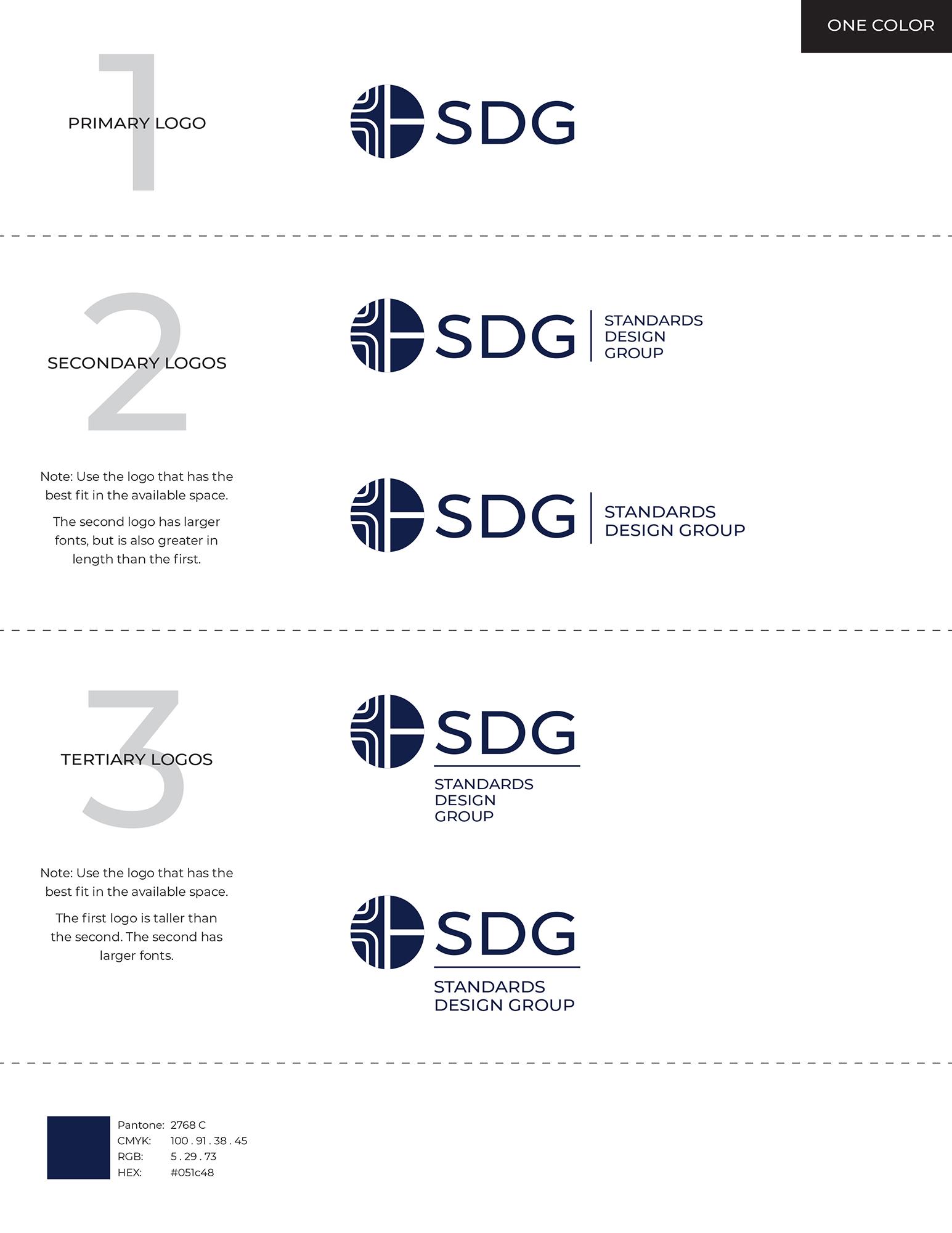
Branding Rules
Once the logo color decision was made final, Lauren tweaked the logo to perfection and then created a range of options suitable for all future scenarios. There are primary, secondary, and tertiary logos in full color, two color, and one color. These options maintain the integrity of the brand, whether printed on a pen or a 20 foot billboard—because there is no such thing as "one size fits all" when it comes to branding.
Flyer graphic design
With the logo and branding process complete, SDG requested a flyer design for their main product: Advanced Window Glass Design Software. The flyer uses the brand colors, typography, and clean grid layout, with the new logo as the icing on the... bottom right corner.
Standards Design Group (SDG) are the creators of advanced window glass design software, but their website was stuck in the past. The old site was full of text and lacking the photos to give it pizzaz.
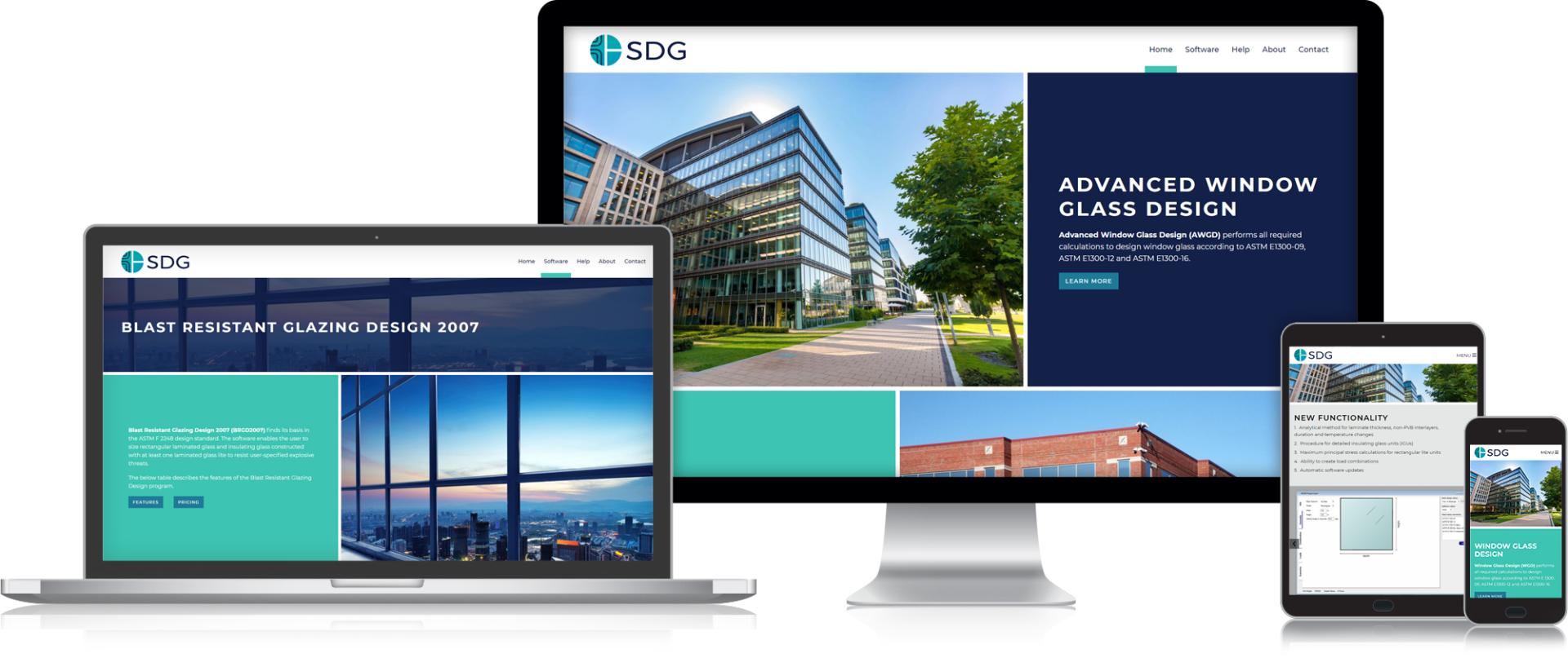
That’s where we come in. Lauren found beautiful photography highlighting standard and complex window design in scenarios where their software may be utilized – wind loads in skyscrapers, blast resistant structures, loads windows bear when built entirely from glass, and the atmospheric effects on insulating windows. While sometimes we have real photography to use, other times, we rely on stock photography to tell the story. We’re experienced with both.
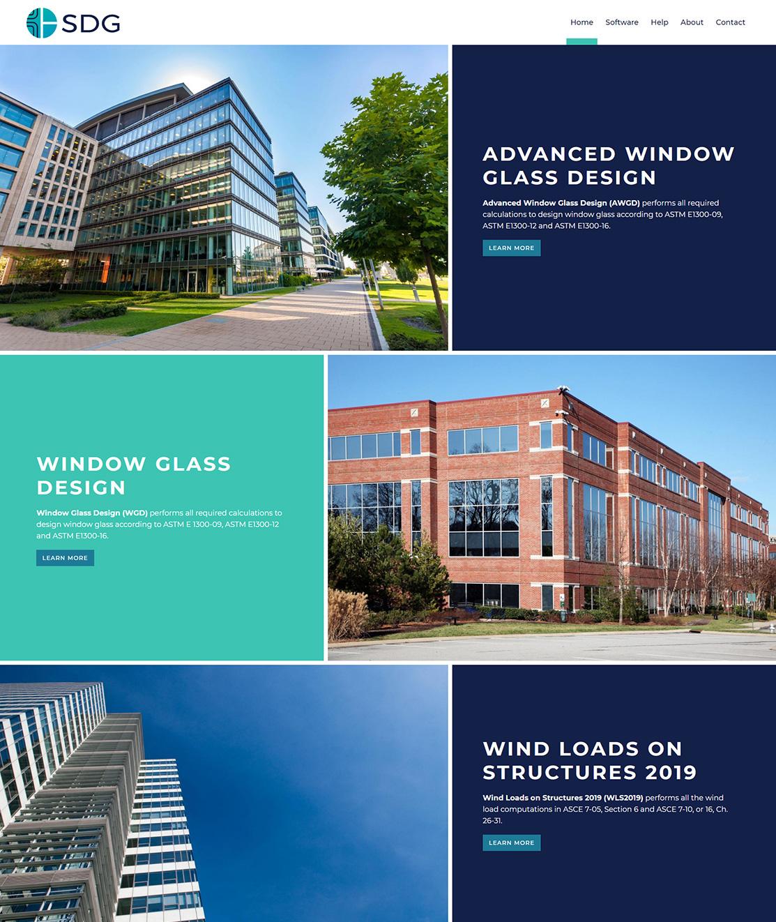
How are homepages built?
What is right for you may vary from what is right for another client. We customize our home page designs to ensure we are sharing the right message with your audience. In the case of SDG, we felt it was important to highlight all of their software platforms, so we went with a scrolling home page approach.
With this solution, each software gets a row featuring a relevant photo, the software name, its features, and a button linking the site visitor directly to the product page. We end the home page with a clear call to action because the last thing we want a user to do is get to the bottom of a page and wonder “what next?” The contact us provides clear action and a bit more background on SDG and their design process.
Landing Page Design
Much like the home page, how we design and build a content page varies based on your needs. In the case of SDG, they needed a place to first explain their software and wow the audience with a photo. We follow that paragraph with action buttons that bring the user down the page to the “features” and “pricing” sections.
The page further highlights the software’s functionality with large screenshots and descriptions of each element. These software pages help the audience compare the different options to gain an understanding on the best software for their specific application.

Pricing with Shopify
The pricing section on each of the software pages is custom built by our developers to pull in pricing and buttons to renew or purchase single license or network licenses of the software using the SDG Shopify account. If running a simple one or two button online store is something you’re interested in pursuing, our team can make recommendations on the best approach, from Shopify Lite to PayPal buttons or a full ecommerce platform, like Shopify.
Help when they need it
SDG said their customers frequently ask for help, so we dug deeper. We asked – what questions do you get asked most frequently and made sure those had a space on the “help” page, in addition to the form, which allows the user to directly contact SDG should their question not be addressed in the FAQs section.
The FAQs block on the bottom of the page expands and collapses to reveal the answers and can be added to with ease by the client as additional (common) customer questions are found. If you find your customers have repeated questions, we find the FAQs block a successful way to handle questions in a friendly and efficient manner.