

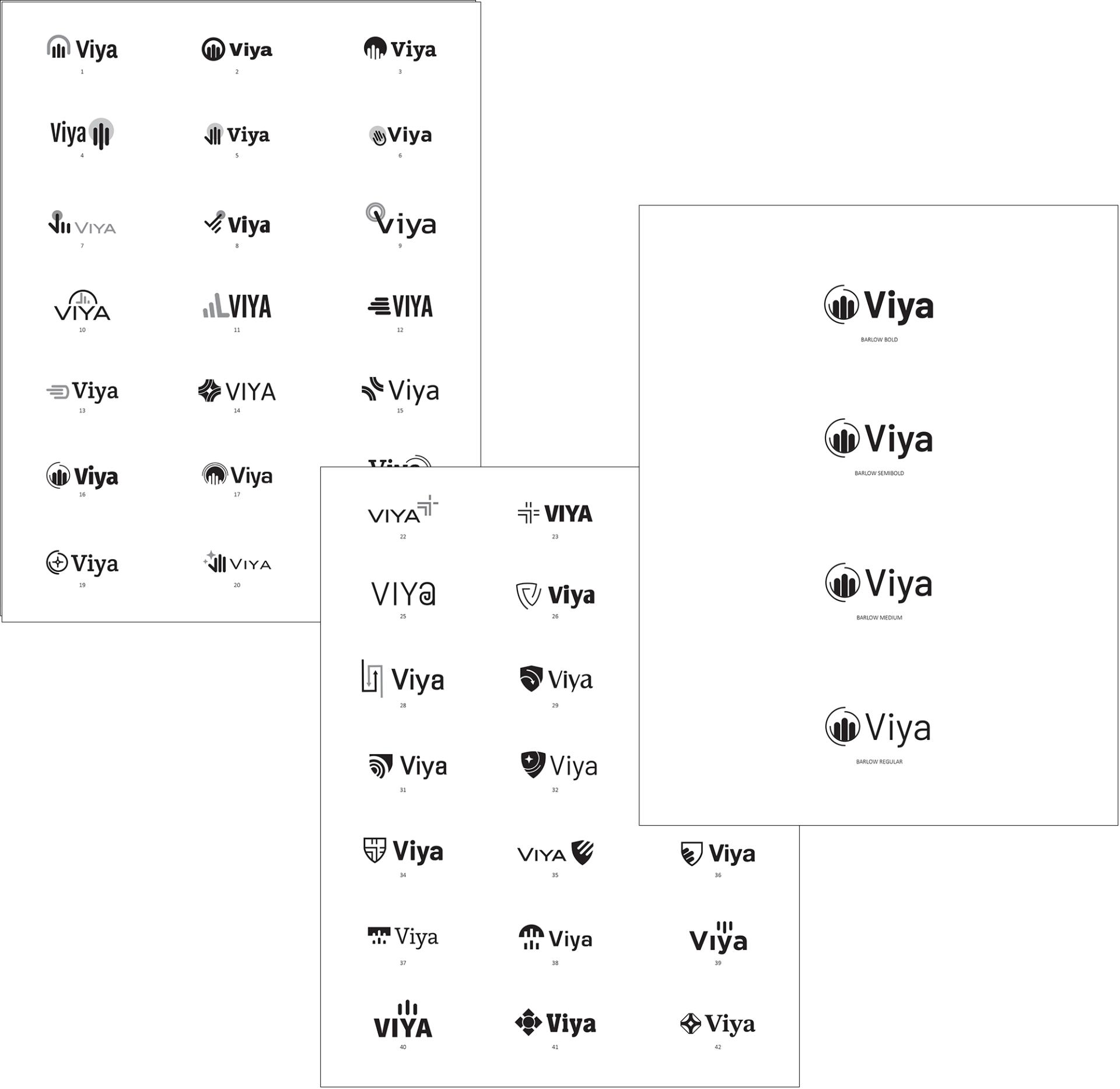
Concept Creation
After soaking in everything she could regarding the product, its key selling points, and the competitive landscape, Lauren designed two pages of black and white logo concepts. We reviewed these concepts live with the client and discussed the meaning of each. Once they chose their favorite logo, we refined the design before moving to the next phase—color.

Touch of Color
Lauren tried a wide range of color palettes before the client selected a teal and copper combination. The teal green closely links to the medical industry and the copper rings imply cleanliness through the natural properties of copper. The subtle gradients in the copper rings add a bit of shine and dimension to draw attention to the implied automatic nature of Viya.
Name. Logo. Animation.
The name was chosen. The logo designed. But soon we would face the biggest challenge yet—an animated video that shows a nurse placing her hands into the Viya automatic glove dispenser within a medical setting. Easy, no. Worth it, yes.
Bringing the animation to life
Matt had to put all of his accumulated animation experience to the test when he created the Viya automatic glove dispenser from scratch... and then took it 1,000 steps further to animate a nurse as she puts her bare hands inside and then removes them perfectly gloved. This animation was critical to the success of Viya, and is featured prominently on the Viya website home page.
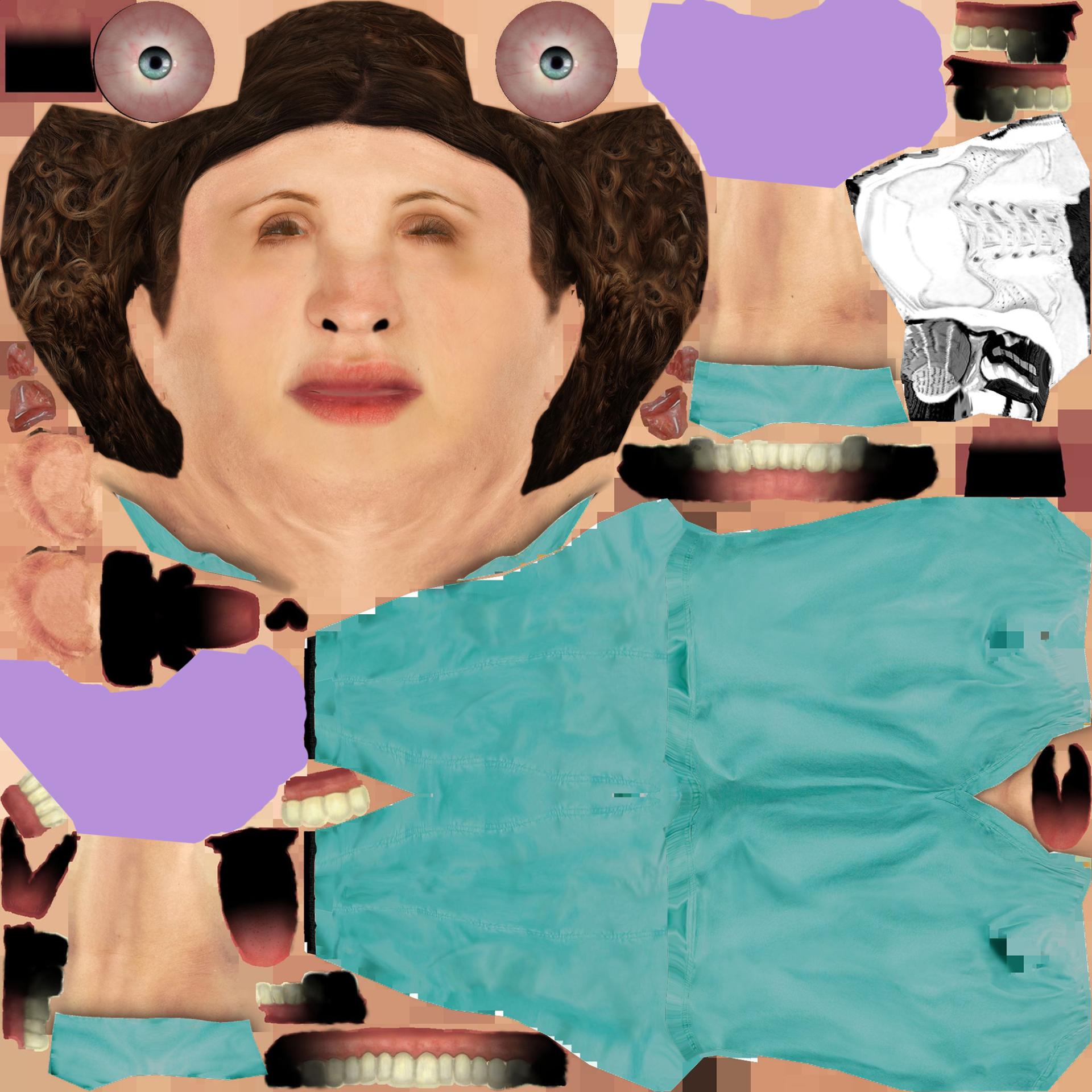
Touching up the texture
'What on earth is that?' might be running through your mind. Admittedly, it took us aback as first-timers as well. If you've ever wondered what a texture map for an animated human looks like... ta-da! Creepy and cool all at the same time, right?
Lauren tweaked the color of her scrubs, gloves, hair, and more to better match the Viya brand colors and look more realistic when rendered under the lights.