

Overview
A fresh identity.
The name Verdigris came with a strong visual story: the natural transformation of copper into something completely different—and instantly recognizable.
We used that idea as a starting point, exploring form, color, and movement to create an identity that feels contemporary, confident, and distinctly Verdigris.
Client
Verdigris
Services
Logo, Style Guide
The challenge
Verdigris needed an identity that could stand apart without relying too heavily on the obvious visual cues behind its name. The mark needed to feel polished and professional, while leaving room for personality, flexibility, and growth.
Our solution
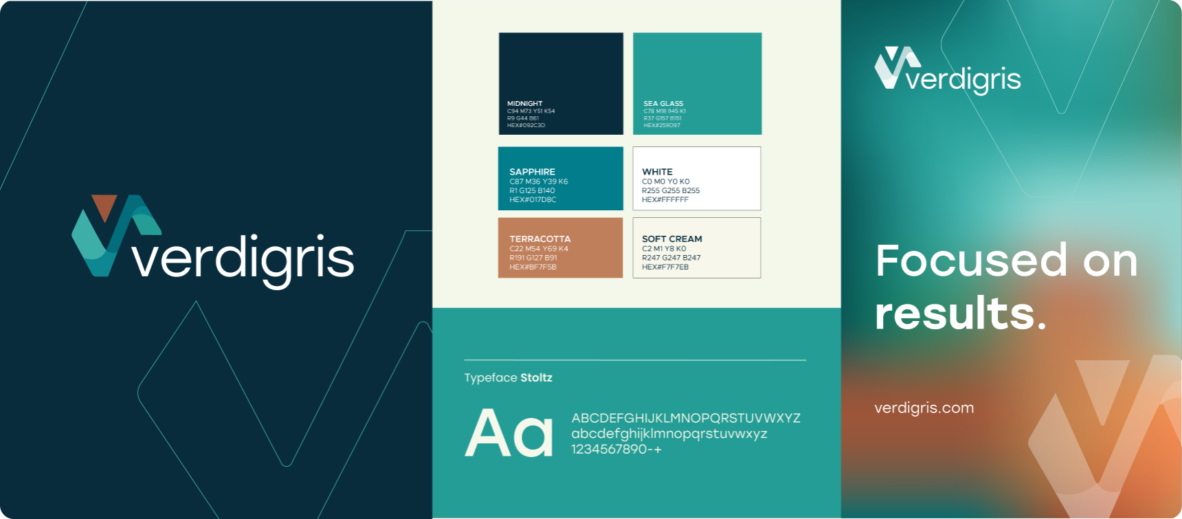
We developed a complete visual system around a custom V mark, a refined wordmark, and a palette inspired by the evolving colors of verdigris itself.
brand Identity
Verdigris
A mark made to evolve.
Palette
Type
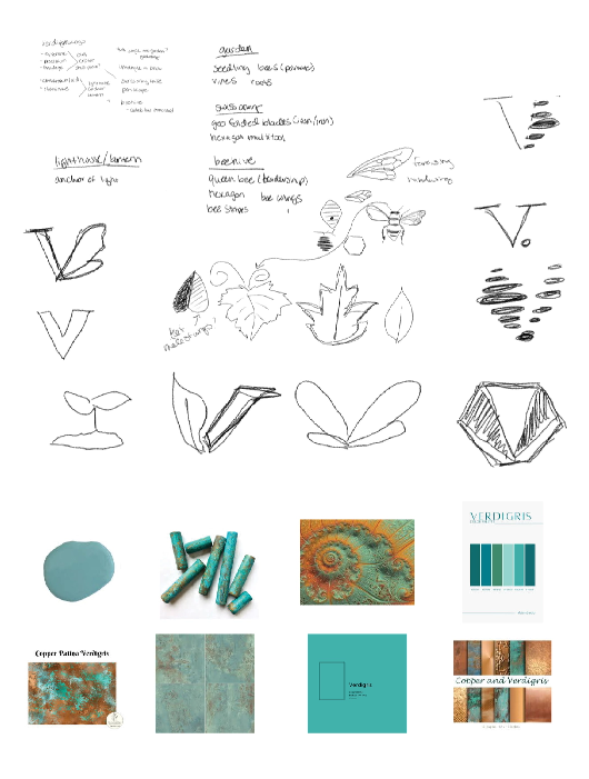
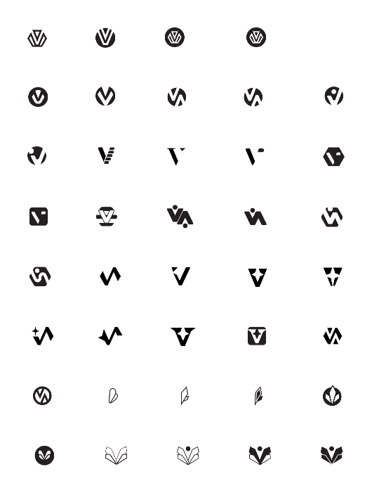
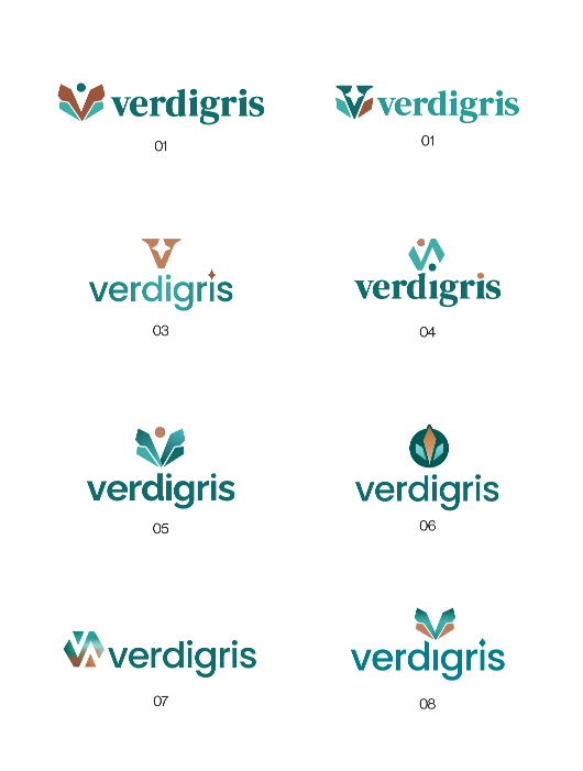
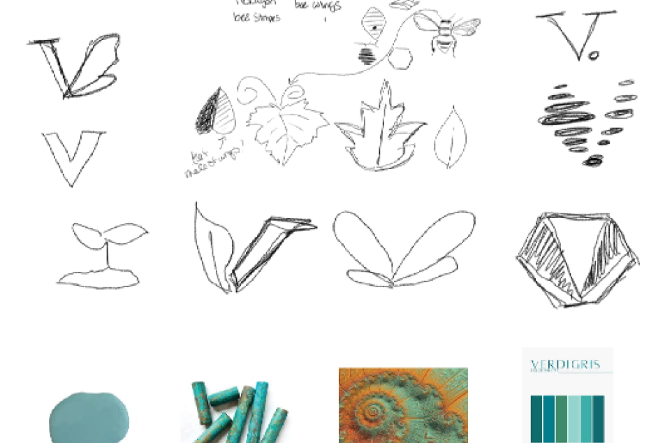
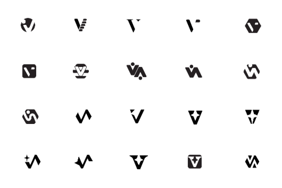
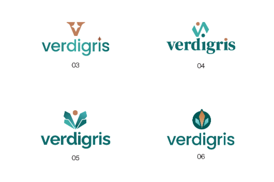
Transforming an Identity
Consistency, covered.
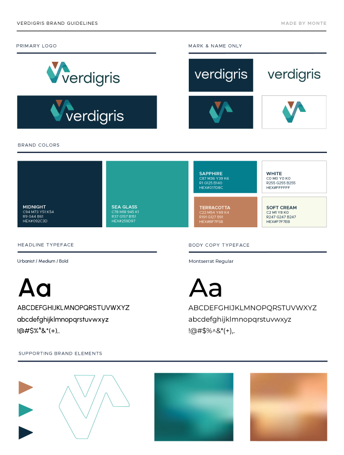
More than verdigris green.
The palette takes inspiration from the name without stopping at a single shade. Sea glass, sapphire, and deep midnight establish the cooler side of the identity, while terracotta and soft cream bring in the warm copper tones behind the transformation.
From guidelines to real life
We tested the identity beyond the brand sheet, visualizing how the mark and palette could perform across everyday applications.
We designed the mark to work both as a full-color identity and as a simplified mark when production, scale, or context calls for something more restrained.
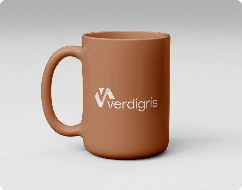
One color. Still unmistakable.
A good mark shouldn't depend on the perfect background or full palette to work. The Verdigris symbol retains its shape and character in simplified single-color applications, making it easier to reproduce across merchandise, promotional materials, signage, and other physical brand touchpoints.