

OVERVIEW
Built from the inside out
Talon Metals was growing into something bigger—a multi-site organization with established operations, emerging projects and distinct teams coming together under one name.
Before designing the logo, we listened. Employee research helped uncover the culture, values, and shared priorities behind the organization. From there, we developed a new identity and complete brand system designed to unite Talon's people, places, and communications.
CLIENT
Talon Metals
SERVICES
Logo, Print, Writing, Brand Package
THE CHALLENGE
Talon needed to bring multiple operations and established identities together without losing the trust, history, and local connections each brand had built.
The challenge went well beyond refreshing a logo. Talon needed a corporate identity strong enough to create unity across locations, flexible enough to support individual operations, and authentic enough to feel like the people behind it.
OUR SOLUTION
We paired research and strategy with identity and design to create a brand system that could grow with Talon.
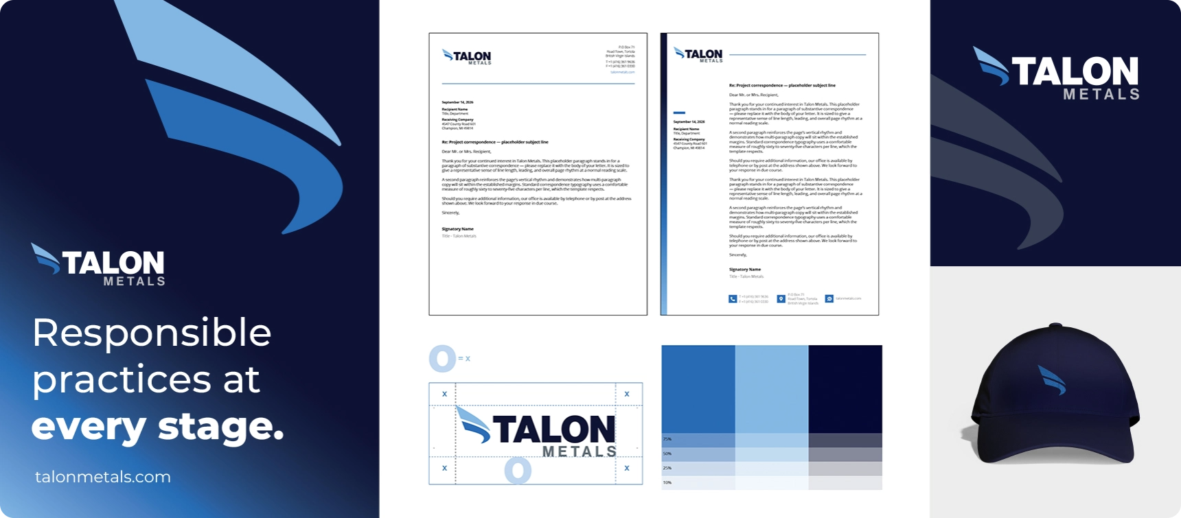
A streamlined logo, defined brand architecture, unified visual language, and practical tools created a consistent way to represent Talon everywhere—from a business card or social profile to a banner hanging at an operating site.
Brand Identity
Talon Metals
Talon’s bird-inspired mark takes flight with a simpler, stronger, more flexible identity.
Palette
Type
IN THE DETAILS
Full Brand Expression
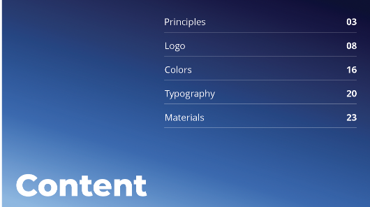
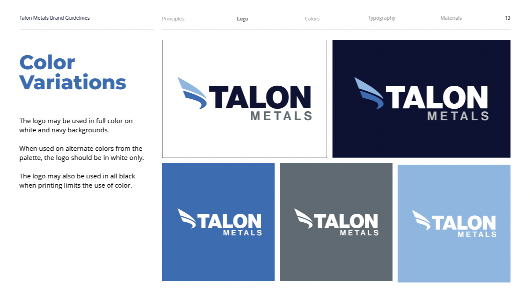
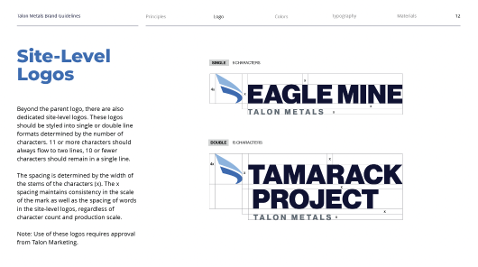
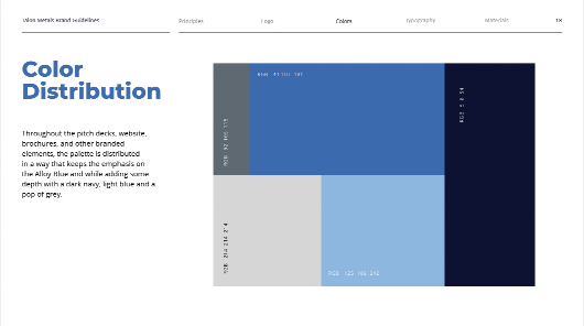
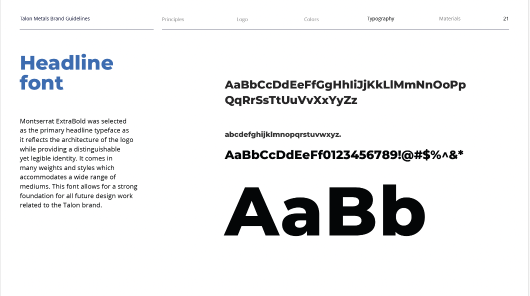
We built a complete visual system around the new identity, establishing clear standards for color, typography, logo use, and site-level branding.
The brand was designed to scale—from Talon Metals at the corporate level to individual projects and operating sites— keeping everything visibly connected.




BEYOND THE MARK
Built for Every Touchpoint
A brand becomes meaningful when people see it, use it, and experience it consistently.
We carried the Talon identity beyond the core logo into a family of practical brand applications—giving employees and teams the tools to put the new brand to work every day.
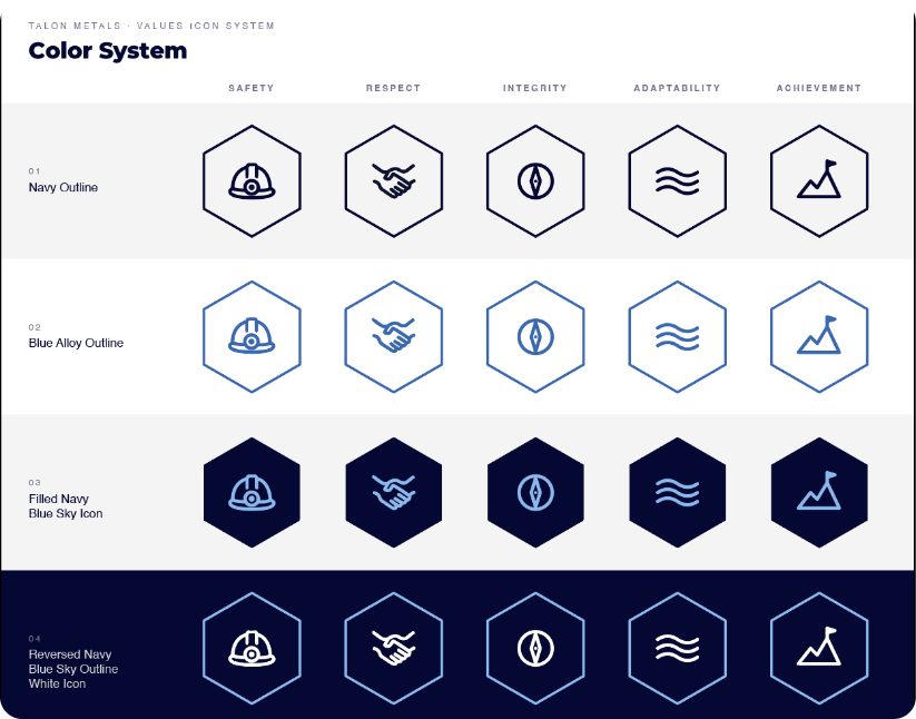
Value Icon System
Talon's values weren't meant to live on a page in a brand guide.
We translated them into a simple icon system built for everyday use across the organization. From internal communications and office graphics to hard-hat stickers and digital applications, the icons give Talon a consistent visual shorthand for the principles guiding its people and work.
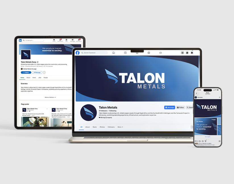
Social Launch Branding
When the new brand went public, Talon's social channels needed to change with it.
We created coordinated social media displays and launch graphics that introduced the refreshed identity consistently across platforms—giving employees, partners, investors, and communities an immediate first look at the new Talon.

Banners, Print, and More
The new identity was made to be shared. We extended the system into business templates, printed materials, banners, and office and site signage—giving Talon a consistent presence everywhere its people work and communicate.
From everyday correspondence to large-format graphics installed across operations, each application reinforces the same identity and helps create a greater sense of unity across the organization.