
Overview
Built for the Long Haul
RIVA needed more than a good-looking logo. The brand had to support a growing RV service business, feel at home with customers investing heavily in their rigs, and remain flexible enough to expand into repair, service, storage, solar, and other future offerings. We developed the RIVA name and identity around that bigger picture.
client
RIVA
Services
Logo, Naming
The Challenge
RIVA’s audience spans longtime RV owners, full-time travelers, and a growing younger generation of campers. The identity needed to communicate high-quality, dependable service without falling into the rough, greasy-mechanic look often associated with RV repair—or becoming so upscale that it felt exclusive. It also needed to work everywhere from a truck and trailer to apparel, invoices, business cards, and digital applications.
Our Solution
We created a clean, modern brand that feels refined without losing approachability. The system pairs a simple, recognizable RIVA wordmark with a compact standalone mark, a warm outdoor-inspired palette, and flexible supporting graphics that can grow with the business for years to come.
BRAND IDENTITY
RIVA Branding
Simple enough for a hat. Strong enough for everything else.
Palette
Type
01
Ideation
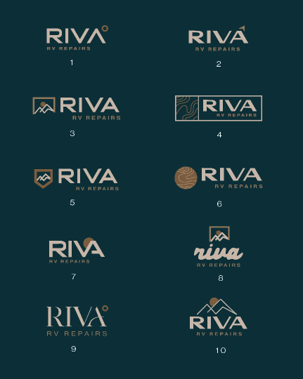
Early concepts explored a wide range of directions—from badges and compass-inspired marks to mountains, topography, and typographic solutions. Through review, the team kept coming back to a balance of sophistication and simplicity, with strong readability and a mark compact enough to work like a favicon or badge.

02
Final logo
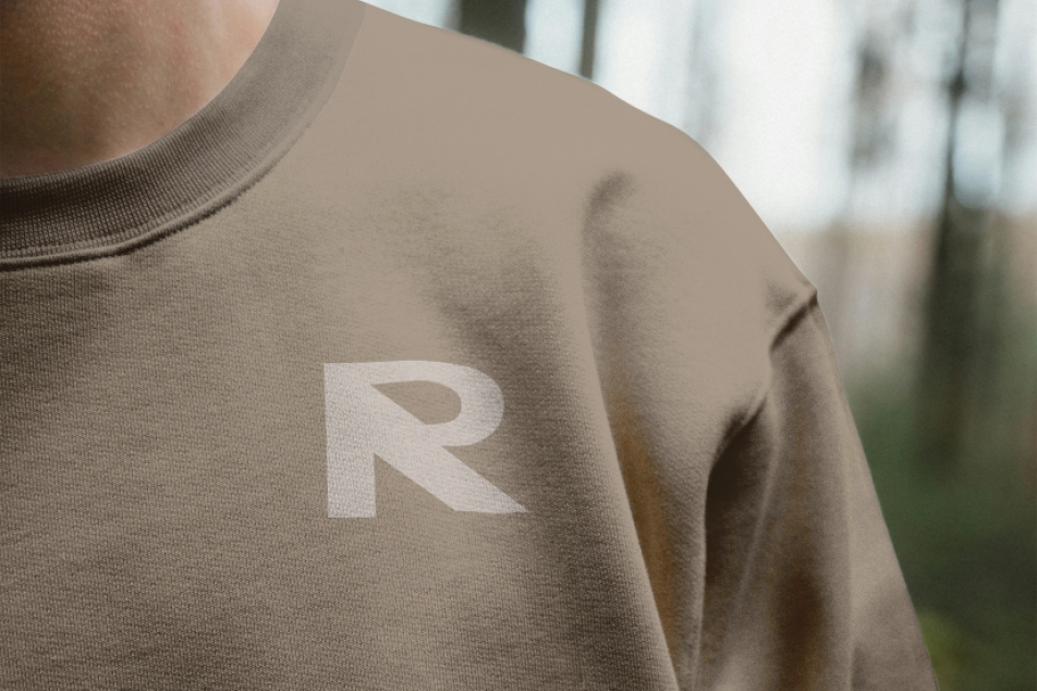
As the concepts were refined, we stripped away elements that could limit the brand or make it harder to reproduce. Mountains and topographic graphics became supporting elements rather than part of the core logo, leaving RIVA with a cleaner wordmark and distinctive “R” symbol that can stand on its own across small and large applications.
The result is intentionally easy to read from a distance, simple enough to embroider, and flexible enough for trucks, trailers, apparel, signage, print, and whatever comes next.
03
Brandscape
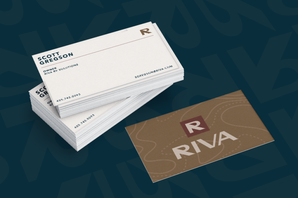
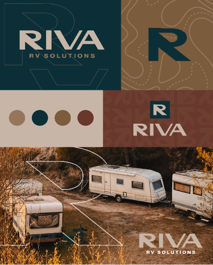
A logo is only one part of an identity. We expanded RIVA’s visual language with an earthy palette, bold typography, topographic linework, photography, and graphic treatments inspired by the freedom and exploration of RV travel. The system gives RIVA plenty of room to shift between polished and rugged applications without losing recognition—whether it’s appearing on a business card, a vehicle, a shirt, or a future marketing campaign.
01
Ideation
Early concepts explored a wide range of directions—from badges and compass-inspired marks to mountains, topography, and typographic solutions. Through review, the team kept coming back to a balance of sophistication and simplicity, with strong readability and a mark compact enough to work like a favicon or badge.
02
Final logo
As the concepts were refined, we stripped away elements that could limit the brand or make it harder to reproduce. Mountains and topographic graphics became supporting elements rather than part of the core logo, leaving RIVA with a cleaner wordmark and distinctive “R” symbol that can stand on its own across small and large applications.
The result is intentionally easy to read from a distance, simple enough to embroider, and flexible enough for trucks, trailers, apparel, signage, print, and whatever comes next.
03
Brandscape
A logo is only one part of an identity. We expanded RIVA’s visual language with an earthy palette, bold typography, topographic linework, photography, and graphic treatments inspired by the freedom and exploration of RV travel. The system gives RIVA plenty of room to shift between polished and rugged applications without losing recognition—whether it’s appearing on a business card, a vehicle, a shirt, or a future marketing campaign.