


overview
Connecting to Trails
PNTS supports a nationwide network of trail organizations with the need to highlight partners, events, resources, advocacy efforts, and opportunities to get involved.
We created a cleaner, more visual experience that helps people learn about the National Trails System, discover trails near them, connect with partner organizations, and find ways to participate.
Client
Partnership for the National Trails System
services
Web
The Challenge
PNTS had a lot to offer—and a lot to organize.
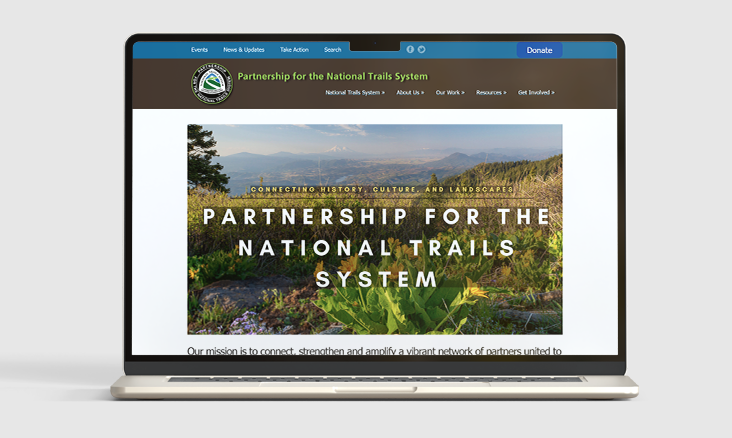
The existing site had become outdated, difficult to navigate, and no longer reflected the scope of the organization or the trails it represents. Their visitors needed a much clearer way through.
our solution
We reshaped the experience around discovery and action.
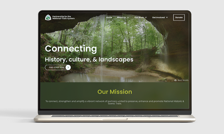
A simplified structure, a way to showcase their strong photography, clearer content groupings, event tools, member resources, and a more prominent national trail experience make it easier for new visitors and longtime partners alike to find what matters—and know what to do next.
The website
Reshaping a web presence
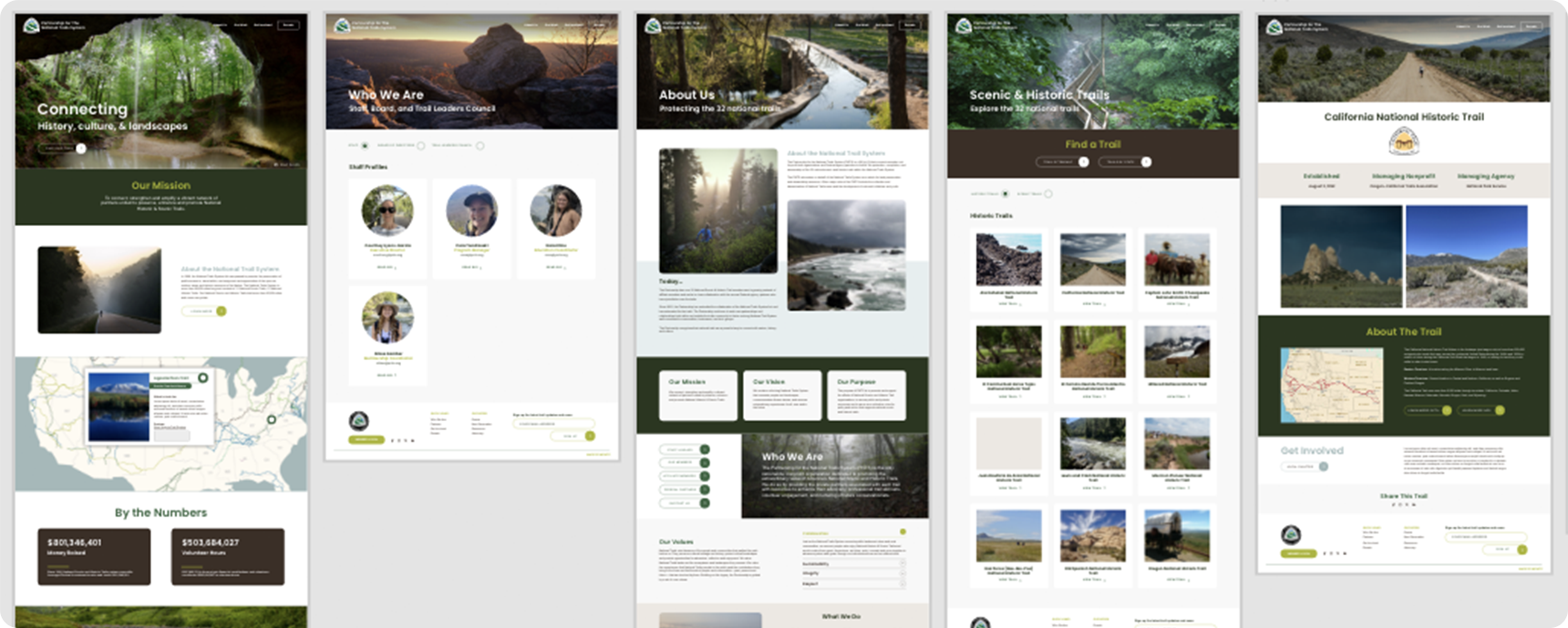
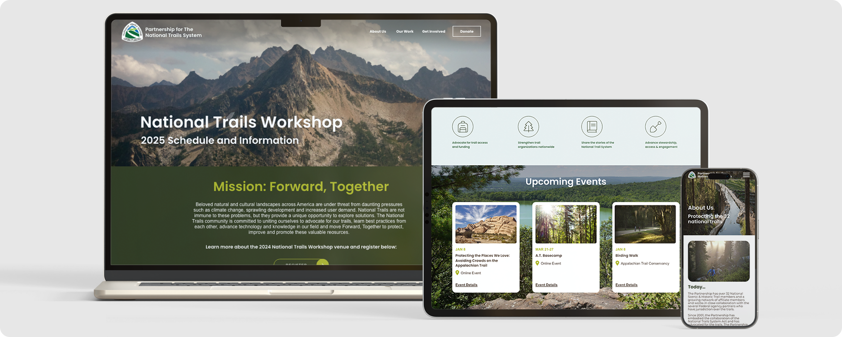
Before and after
Talk about a transformation.
BEFORE
AFTER
transforming an identity
Bringing the outdoors in

More Miles From the Palette
PNTS already had an established logo and visual foundation, so we didn’t reinvent the brand.
Instead, we expanded their existing colors into a more flexible digital palette inspired by the landscapes the organization represents: deep forest greens, brighter trail-inspired accents, soft blue-grays, and warm neutral backgrounds.
The result feels connected to the existing organization while giving the new website greater contrast, hierarchy, and visual range.
Reported Aug 24, 2026 at 10:51am, by Ashley Curtis