Overview
Preserving the place.
Fishtown isn't something you can sum up with a single building, boat, or story. It's a working waterfront, a historic district, a gathering place, and a connection to generations of Great Lakes fishing traditions.
We evolved the Fishtown Preservation brand to better capture that whole experience—from the logo and color palette to custom illustration, photography, rack cards and branded materials designed to carry the story into the future.
CLIENT
Fishtown Preservation
SERVICES
Logo, Print, Writing, Illustration, Photo
THE CHALLENGE
Fishtown already had something most brands would love to have: history, recognition, and a deep emotional connection with generations of visitors.
The challenge was evolving its identity without polishing away the character that made it special. The new brand needed to represent not only preservation, but the boats, buildings, working fishery, people, and everyday experiences that continue to make Fishtown a living place.
OUR SOLUTION
Our team built on what people already knew and loved.
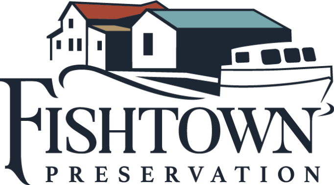
We refined the familiar identity, created a palette rooted in the place itself, and expanded the brand into illustrations, patterns, photography, and print materials. Together, those pieces created a flexible visual language capable of telling more of Fishtown's story without losing sight of its rich and deep history.
Brand Identity
Fishtown
A refreshed identity rooted in the place people already know and love.
Palette
Type
Before and After
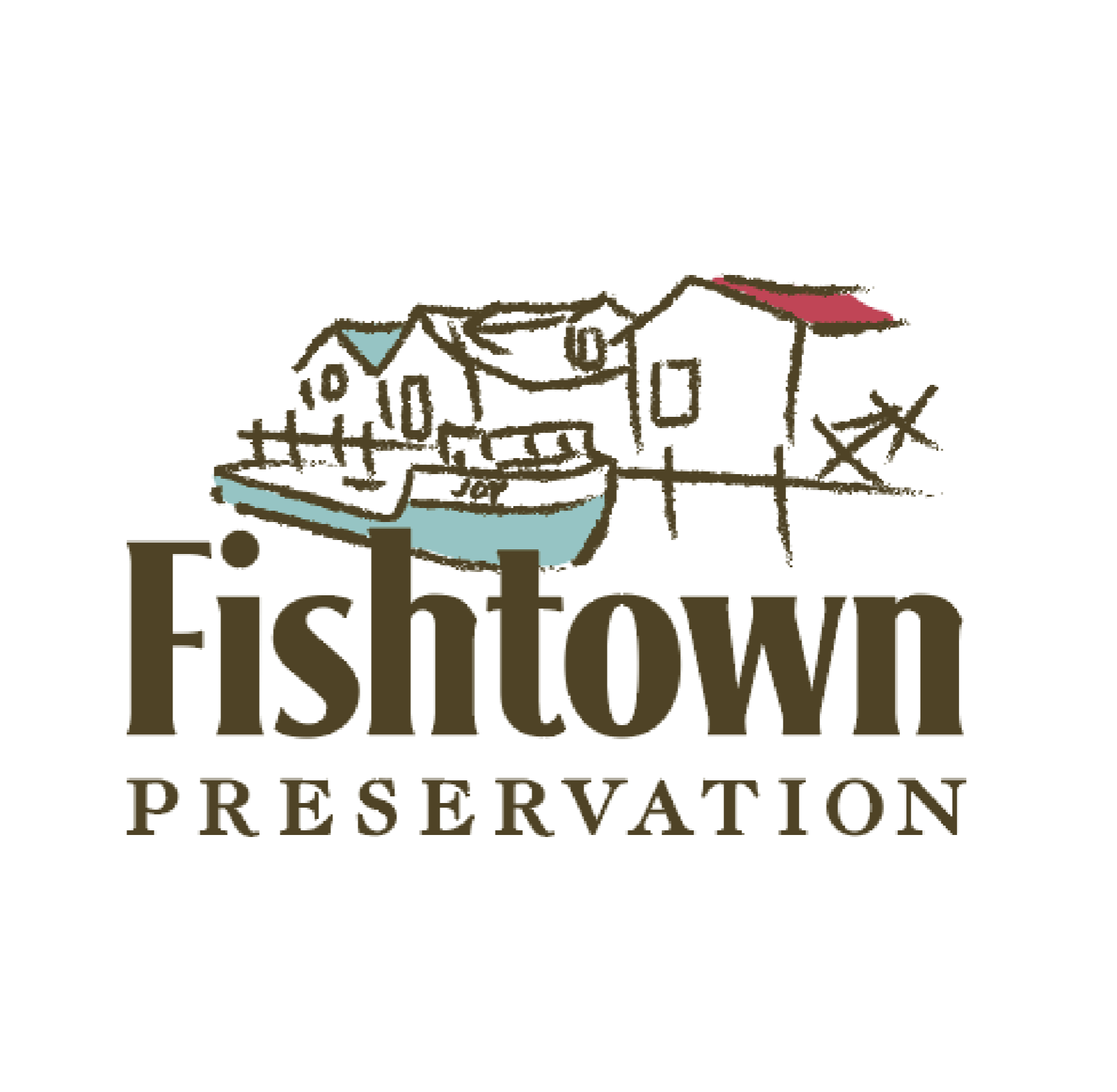
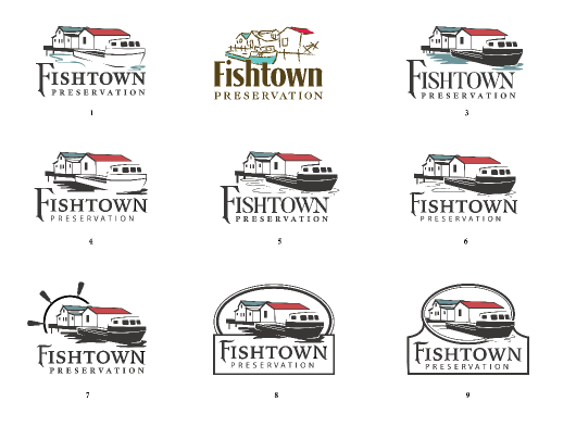
Same company, finally dressed for the part.
Call it a glow-up, we call it a brand evolution.
Fishtown Preservation
Tourism
Fishtown kept its familiar character while gaining a stronger brand built to tell a bigger story.
BEFORE
AFTER




Beyond The Mark
Built for Every Touchpoint
The identity was extended into practical and expressive applications that could support visitors, donors and the organization itself—from everyday communications and educational materials to keepsakes people can carry home.

Custom Brand Packaging
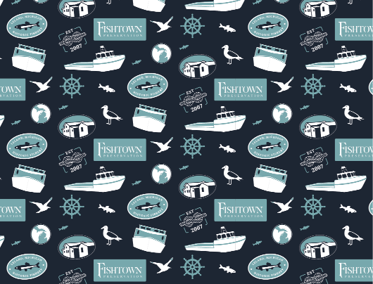
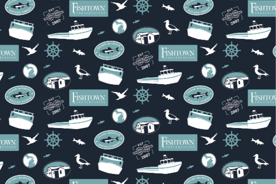
To help visitor's take Fishtown with them wherever they go, we extended the visual identity into custom packaging.
The refreshed logo pairs with a custom illustrated pattern built from recognizable Fishtown imagery, creating packaging that's functional, memorable, and unmistakably tied to the place.
Rack Cards
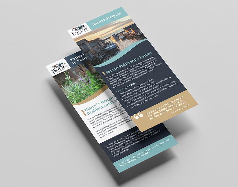
There's a lot to say about Fishtown.
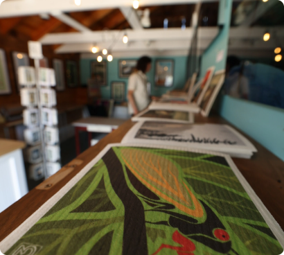
We created a flexible rack card system that gives Fishtown Preservation a consistent way to share individual stories, programs, and preservation efforts without making every piece look exactly the same.
The photography, color, writing, and the new identity come together in compact materials designed to educate visitors and give them another reason to look closer. Fishtown's planning included rack cards and future brochure topics ranging from commercial fishing to people, plants, and ways to support the program now and into the future.
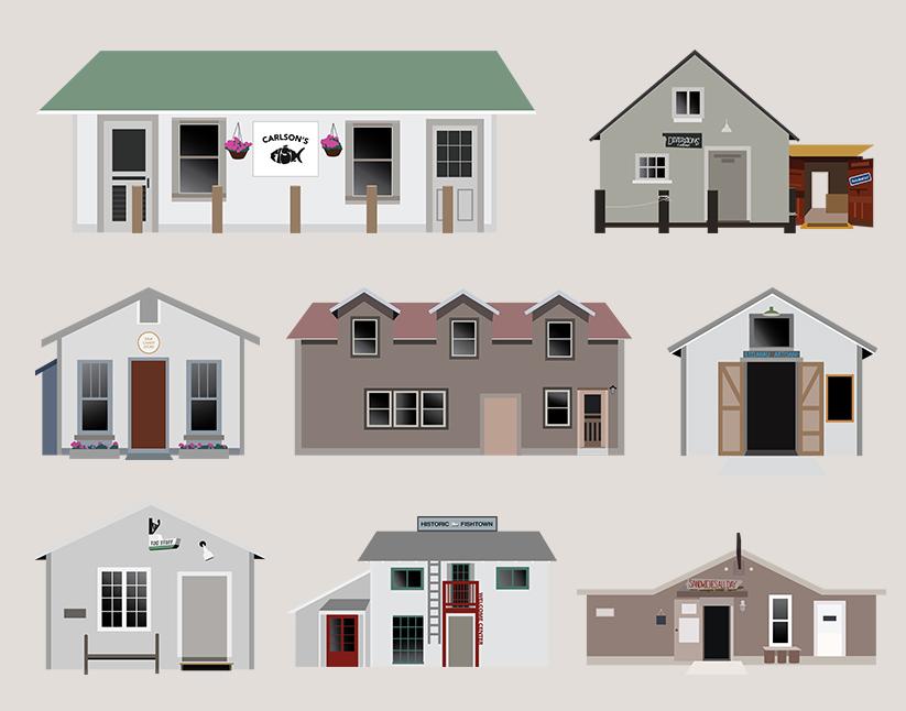
Custom Building Illustrations
We get that every shanty has a story. The buildings in Fishtown are not simply a backdrop—they're part of the story.
Our design team created custom illustrations of the individual shanties and buildings, translating their distinctive shapes, doors, windows, rooflines, and character into a consistent visual style.
Together, the illustrations form a library of recognizable places that can live across educational materials, maps, print pieces, and other brand applications—helping Fishtown tell the story of the waterfront one building at a time.
Photography showcase
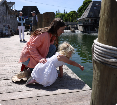
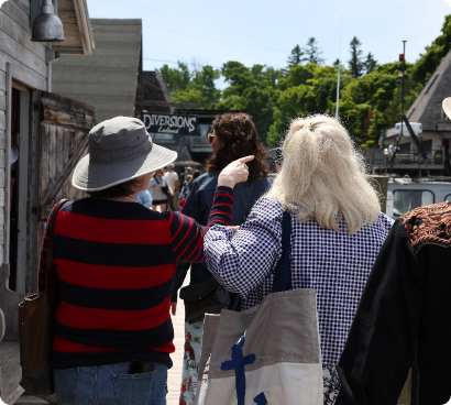
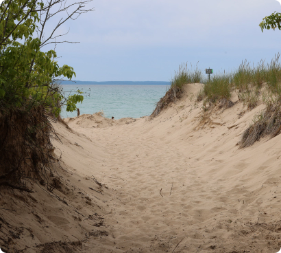
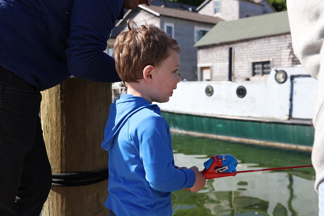
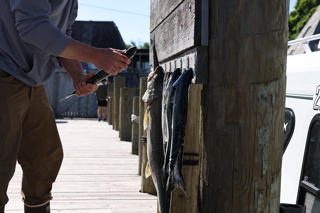
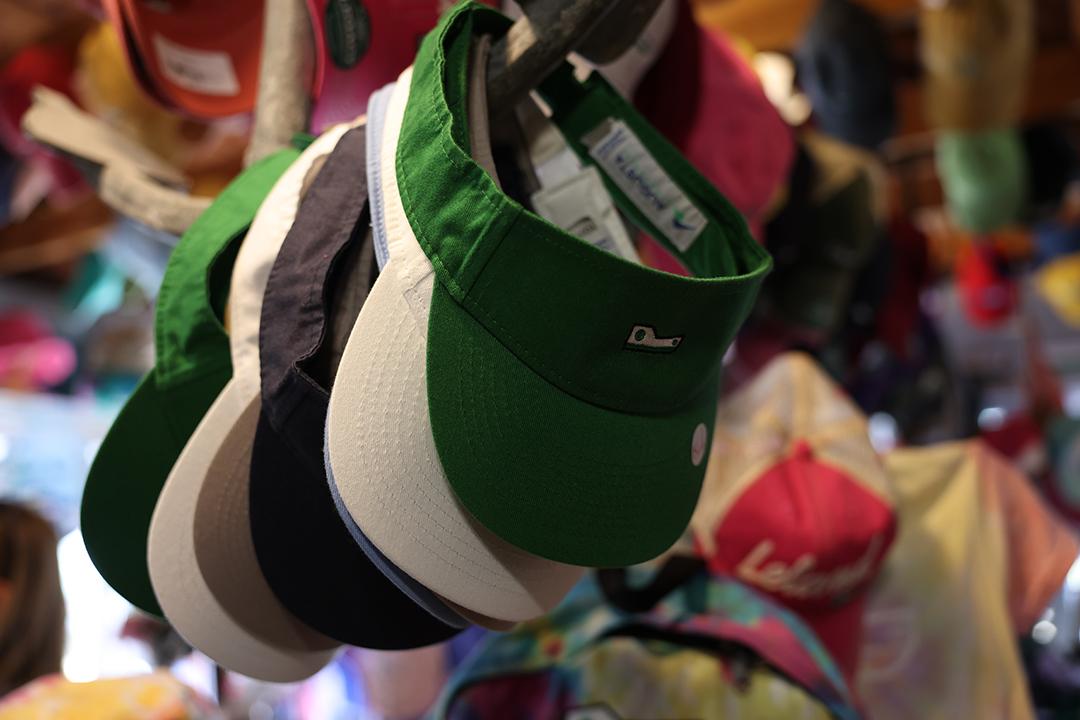
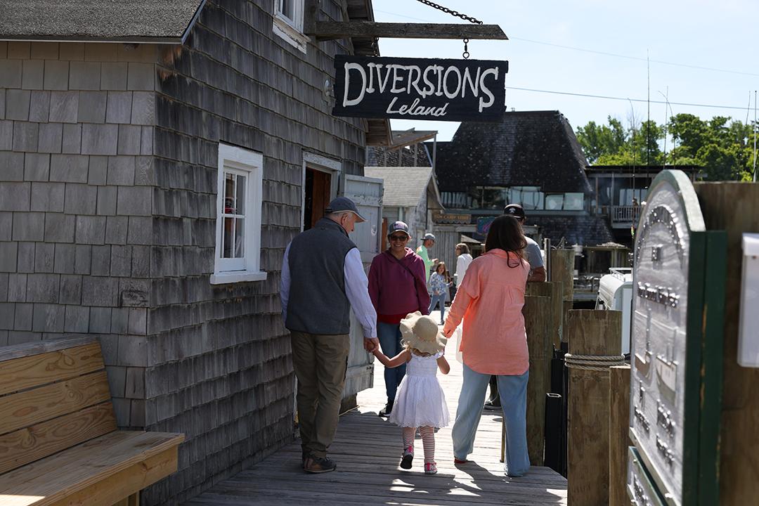
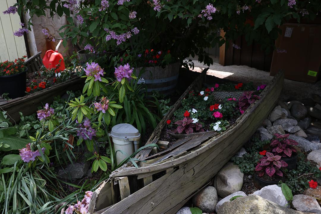
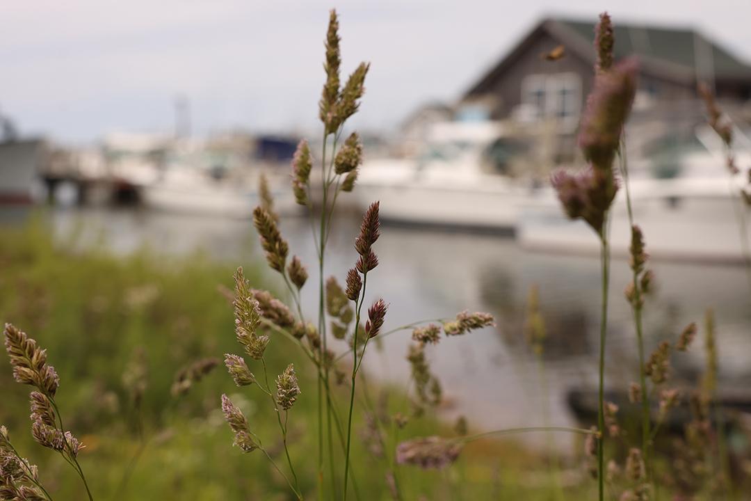
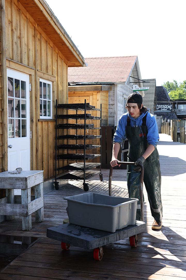
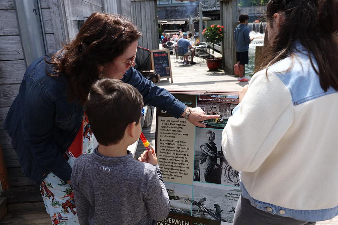
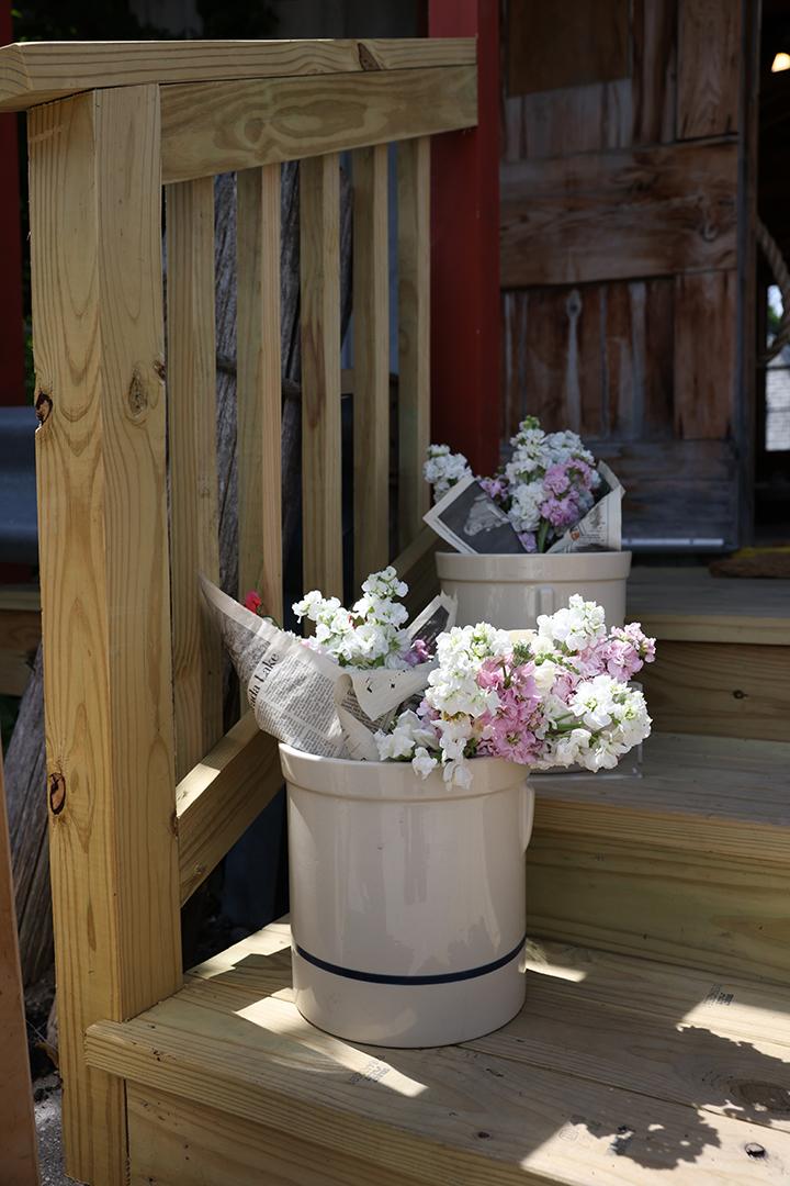
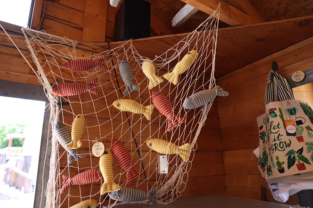
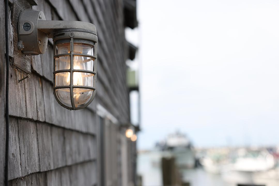
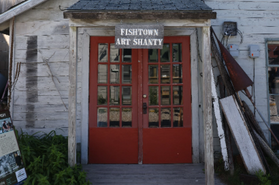
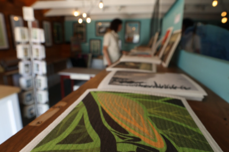
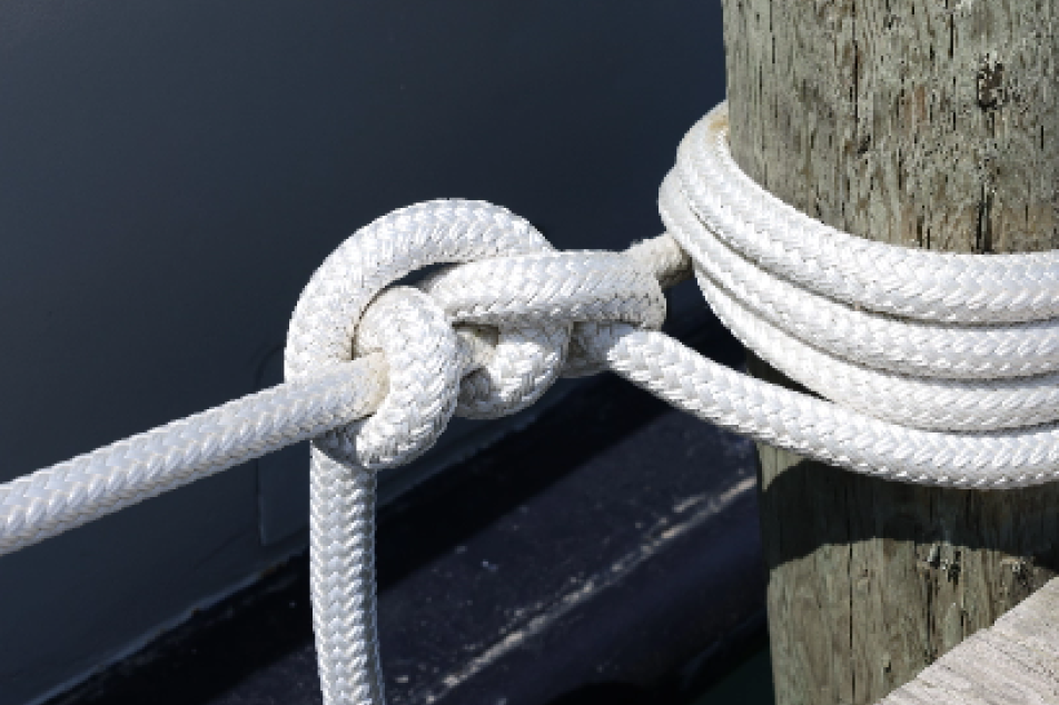
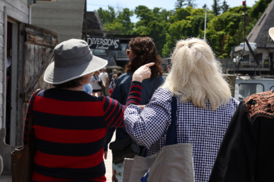
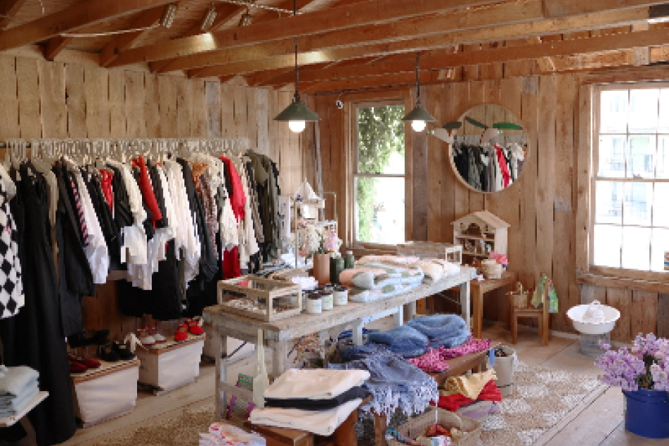
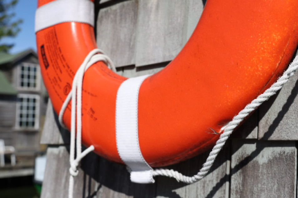
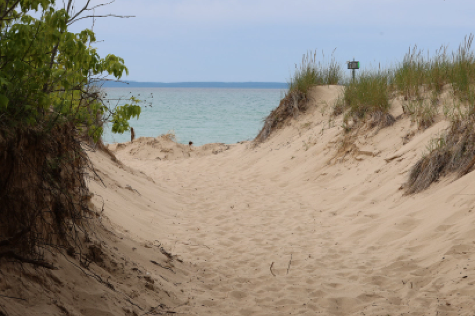
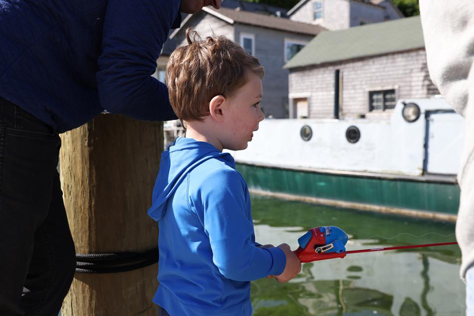
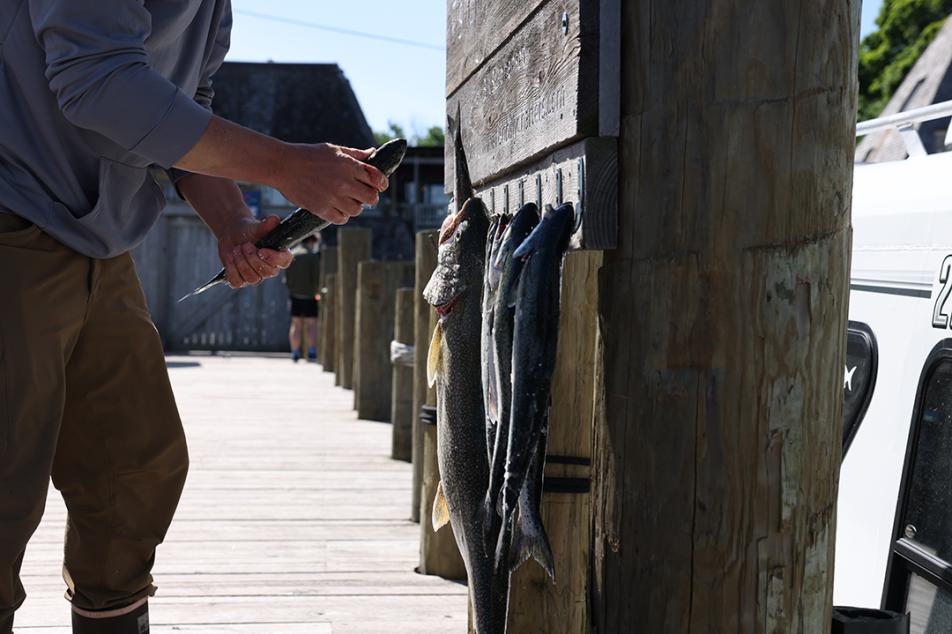
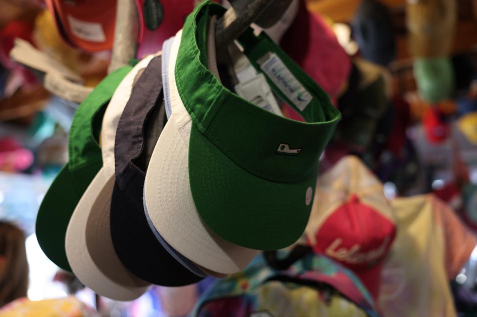
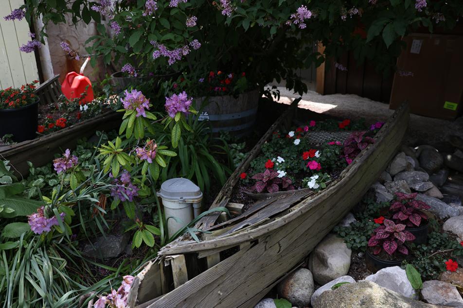
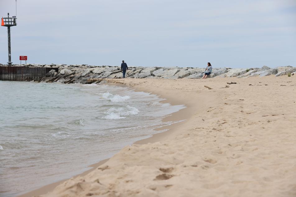
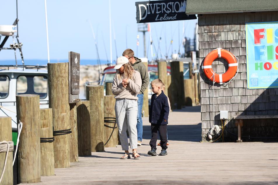
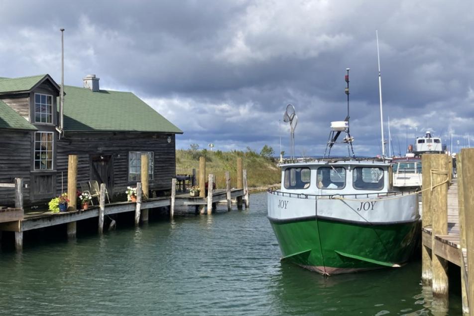
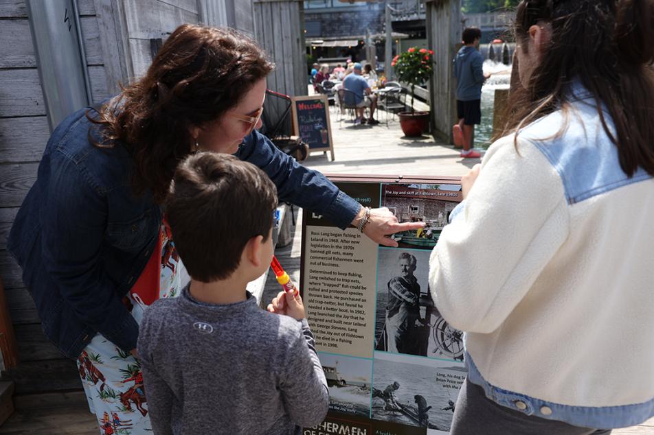
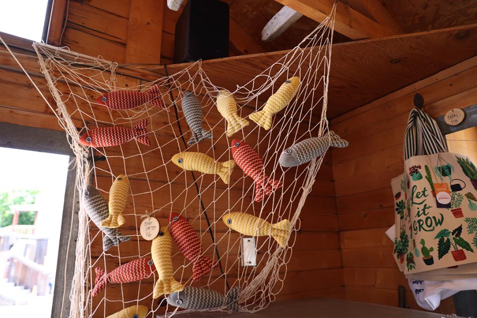
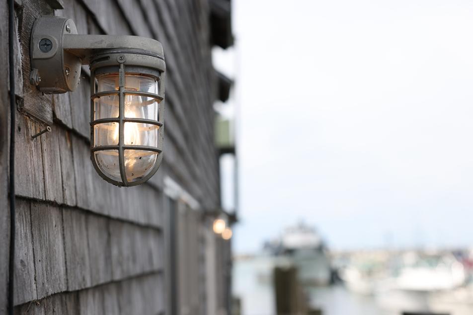
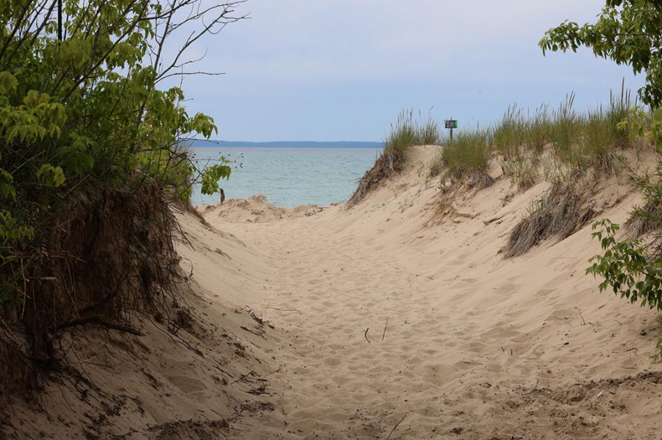
Our photography focused on the details and interactions that make the place feel alive—the weathered shanties, ropes and docks, people along the waterfront, working spaces, boats, and the small moments visitors remember long after they leave.
The goal was the same one established early in the project: help people experience enough of Fishtown to see it, hear it, and almost smell it—and still want to experience the real thing for themselves.