

overview
Built to Last
From the logo to the CANVA templates to the refreshed and easy-to-navigate website, our work gives the township a professional, approachable brand system that can grow with the community.
Client
Breitung Township
Services
Logo, Style Guide, Print, Web
The challenge
Breitung Township’s existing identity had history, but it no longer represented where the community was headed. The logo needed greater flexibility, consistency, and longevity, while the website needed to make township information and everyday services easier for residents to find and use.
our solution
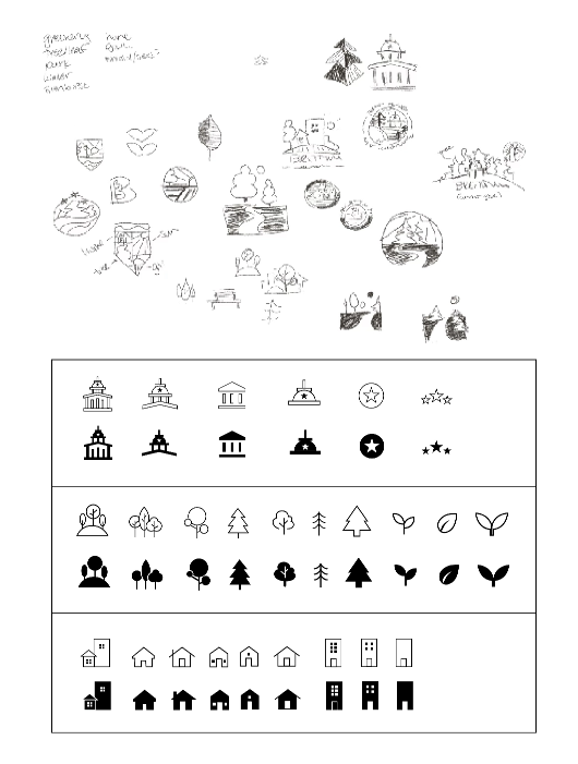
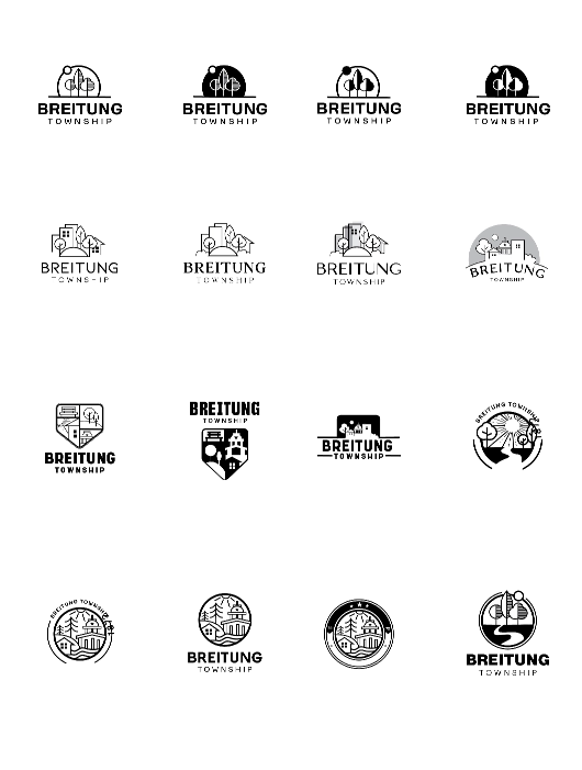
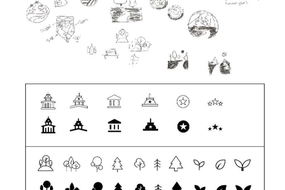
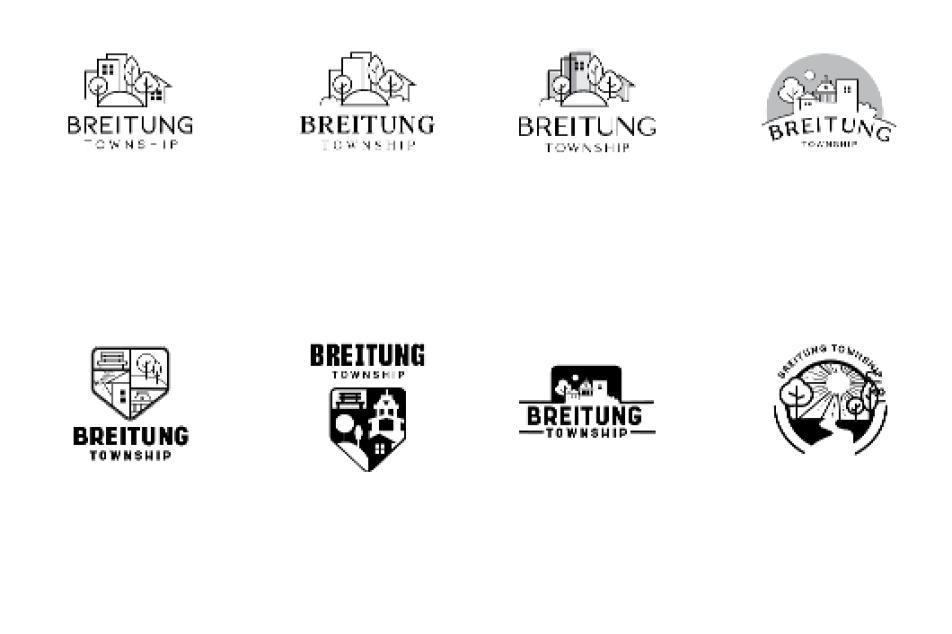
We developed a refreshed identity rooted in Breitung’s community, landscape, and sense of place, then created the tools to put it to work—from a complete style guide and print materials to a modern, resident-focused website built for clarity, consistency, and easy access.
Brand Identity
Breitung Township
A modern municipal brand built around the people, places, and possibilities of Breitung Township.
Palette
Type
TRANSFORMING AN IDENTITY
Style guide for brand consistency
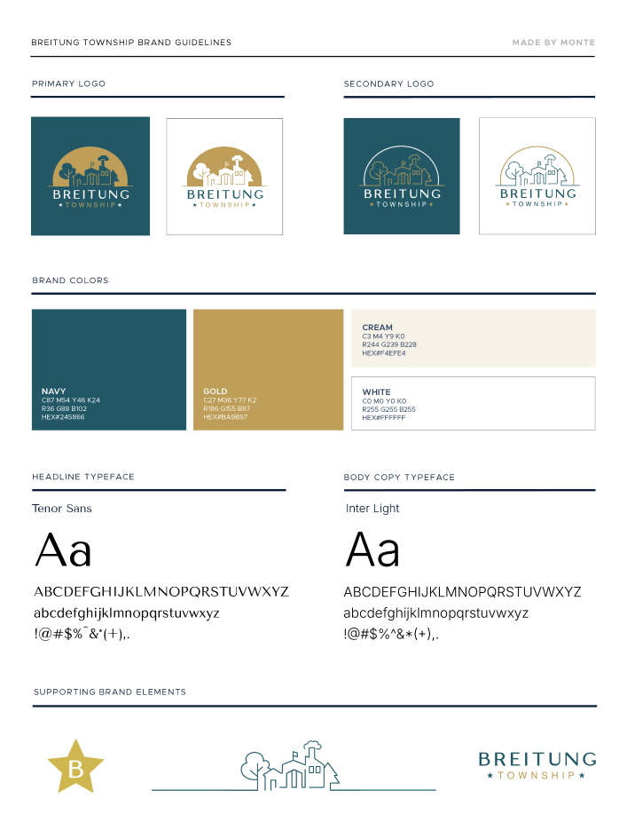
One Township. One Visual Language.
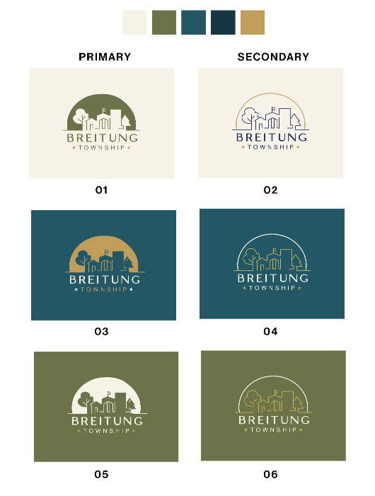
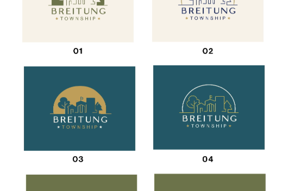
A strong identity only works when people know how to use it. We created a practical style guide defining logo variations, colors, typography, and supporting graphic elements so departments can communicate consistently while still having the flexibility needed for everyday township business.
The result is a brand system designed to stay recognizable whether it appears on a business card, letterhead, website, community announcement, or something that hasn’t been created yet.
The website
Reshaping a web presence
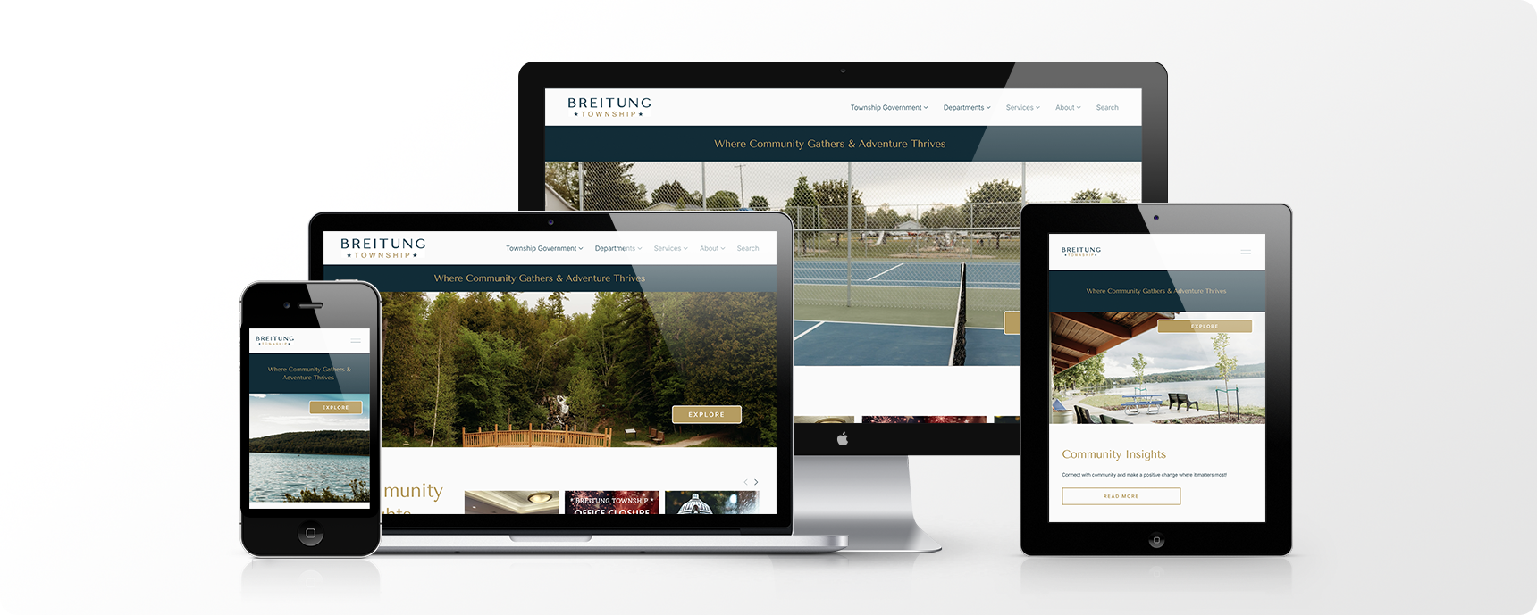
Making Township Business Easier
The new website was designed around a simple idea: residents should be able to find what they need.
We created a clean, responsive experience with straightforward navigation, readable content, strong visual cues, and easy paths to important township information and services. Calendars, forms, payments, announcements, contact information, and other resident resources are brought together in a site that feels modern without sacrificing familiarity or ease of use.
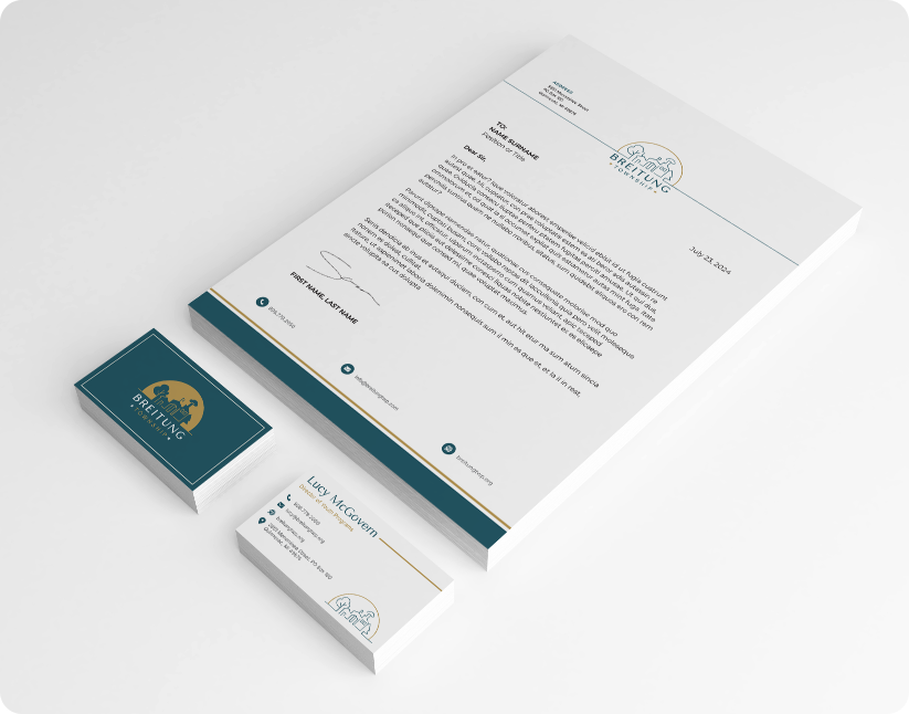
Brand Print Materials
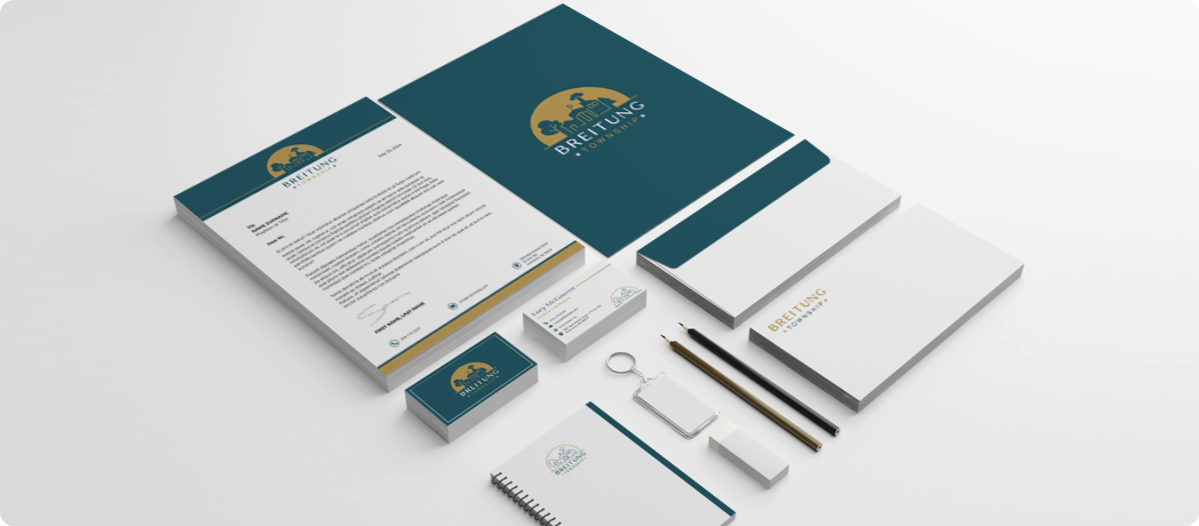
The new identity carries into the materials township employees use every day. We developed coordinated business cards, letterhead, and adaptable templates that give departments a polished, professional way to communicate while keeping the Breitung brand consistent.
The system was built with real-world use in mind—easy for township staff to maintain, flexible enough for different departments, and consistent enough to always feel unmistakably Breitung.