CLIENT
We need to strengthen the Finlandia brand.
MONTE
The brand starts with the logo. Can we start there?
CLIENT
Yes. Let's do it.
MONTE
Together we will redefine the Finlandia brand experience. Here are our ideas...

Before
The Finlandia University logo had several issues: The letter spacing was too tight, the leaf too large, and overall balance and unity was lacking.

After
The new logo uses a simple, clean typeface reversed out of Finlandia blue. The minimal approach allows the focus to be placed where it belongs—on Finlandia.

STYLE GUIDE
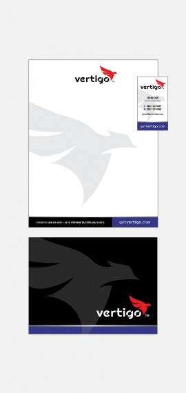
Finlandia asked Monte to create an identity style guide to help them carry out the new brand in-house in the future. During this process, numerous design templates were generated: business cards, letterhead, PPT templates, signage, email blaster, social media branding, posters, flyers, ads, billboards, course catalog cover, uniforms, tv commercial, video monitors, registration forms, viewbook, and lead piece.

Lead Piece
After redesigning the logo, Monte created two key print pieces to be used for recruiting new students. The Finlandia lead piece is used as a tool to introduce students to the university in a concise manner that could be easily presented at college fairs and sent in the mail.

Viewbook
The larger print piece, the Finlandia view book, offers students a more detailed look at the university's culture, degree programs, athletics, and tuition structure.


Tagline • Writing • Commercial
Branding doesn't stop at a new logo. Nor does it only encompass visuals. Finlandia needed to redefine their brand, and to do that, needed a new message to accompany their new visuals. After much discussion and lists of ideas, the new tagline—Where you belong—was born. Monte continued to expand on this new concept through headlines and text in the print materials, and then writing the script for a new tv commercial that embodied the concept that Finlandia is where everyone has a place.
Additional Marketing Media


