


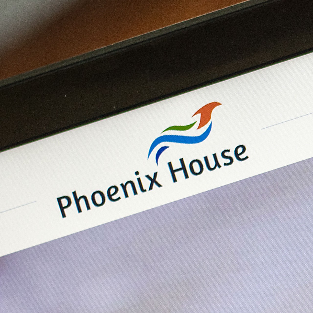
LOGO DESIGN
In the treatment and recovery center sector, customers need to know they can trust those they are turning to for help. Lauren worked with the client to rebrand the Phoenix House, still using the phoenix in the logo, but with trusted blues and greens in a stable font. The phoenix in the logo can also be interpreted in a number of ways – one as a larger bird, and one as a smaller bird rising out of the water, alluding to the rising up and changes that occur in treatment.
Contact us to learn about the importance of strong branding

MULTIPLE LOCATIONS
The Phoenix House has four locations in the Western Upper Peninsula, so the client wanted to be able to show those on a map with an option to click directly on the location dot for directions to the facility. We built the Drupal website, including the location map featured both on the home page and on the locations page. The locations page features additional information on the facility; including the phone number, address, services, meeting information, and directions. The locations information is also formatted to be displayed on the contact page.

SHARING THE MESSAGE
Phoenix House changes the lives of those in treatment and recovery and their families, so Lauren illustrated that message to the audience through the use of calming imagery and captivating headlines. The phone number is also prominently displayed so those that need help can easily see who to call.

BRAND ELEMENTS
The new logo design was further applied to business cards and signage present at the client’s four western Upper Peninsula locations in Calumet, Hancock, Ontonagon, and Bessemer.


