Have you ever dreamed of selling (almost) everything you own and travelling the world?
We have to admit, the idea is tempting! Scott and Sasha, the people behind Stonyboot, did just that! They are full-time truck campers who work remotely and blog about their adventures of life on the road.
While talking to Scott and Sasha in the very first "meet and greet" Zoom, Lauren created this quick logo concept. She saw the name Stonyboot not only inside the boot, but forming the boot itself.
In our normal logo process we create 30-50 logo concepts (or more). But in this case we all felt strongly that this idea could be "the one" so Lauren ran with it... and the new Stonyboot brand was born.
Scott and Sasha loved the logo concept, but our work was far from done. Together we analyzed every nook and cranny—from the shape of the sole, to the laces, to the question of B vs b.
The tread was refined to look more similar to the hiking boots Scott and Sasha wear, and the B became b. Next we focused on the laces and the o's... could we build more meaning there?
How do we bring a logo from good to great? By refusing to settle.
What if the laces became a mountain path? Or should they represent more of a meandering journey? After several rounds of exploration we all agreed that the laces in the lower right best represented Scott and Sasha's life journey of pivots and bends. Next we contemplated the start and end points—should they be simple and abstract or tell a story? The final logo features a map marker and end point to make it clear the laces are also representing the variability of life.
Uh o... what about the stones?
Basic o's are oh so boring. What if the o's became stones? From rough cut rocks to gently sloping stones, we explored the o's from every angle. The o's in the upper left are clearly stone-y, but they lost their integrity at small sizes. We ultimately decided that less is more in this case. The final logo has perfectly imperfect o's that operate both as stones and o's... because readability in a logo rules.

Branding goes far beyond the basics.
Stonyboot has a strong presence on several social media platforms, and if they want to continue to grow, their brand needs consistency. As part of the branding process, we analyzed font options that were 1) bold, 2) unique, 3) condensed, and 4) flexible. Bold and condensed to stand out in video thumbnails and fit more letters in a small space. Unique to match the Stonyboot story and flexible so they can be implemented across all platforms.
Emojis and more
Because YouTube is their main outreach vehicle, Scott and Sasha requested custom loyalty badges and emojis. Lauren created the emojis using the same stone style as the o's in the logo, and used a range of bright colors that play off their core brand color of yellow.

Down to business
A striking combination of yellow, black, and white was chosen for the new Stonyboot brand. A mountainside was created to form a two-tone background as seen in the business card. An outlined version of the logo adds additional dimension and will work perfectly as a die cut sticker to hand out to fellow travellers and followers.
Lost in the right direction
Scott and Sasha wanted a tagline to accompany their new brand. Many ideas were shared (and YouTube videos watched) before "Lost in the right direction" was declared the winner. It pokes a bit of fun at the fact that the one consistent part about travelling is occasionally getting lost... and often the best adventures happen as a result!
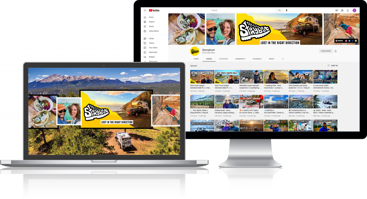
Branding on YouTube
Using the new logo and established brand colors and fonts, Lauren designed a YouTube background banner using a collage of photos highlighting several of Scott and Sasha's adventures. The full background (in the laptop) is seen on TV screens, while a narrow slice of the background is shown on desktop computers, and a still narrower slice visible on mobile devices.


