What's in a name?
A new client came to us looking for supporting in their start-up journey. The client had generated a number of naming options and were lukewarm to them. Working with us allowed them to refocus their energies around developing the business. We took what we knew from email interactions and client meetings to develop a creative brief that highlighted the companies product, their processes, and their competitive advantages. From there, we defined the key concepts, the pair word, and established the root words. Our proprietary name generation tool uses the root words to build a list of 99 related terms. From the initial root words, we generated more than 4,700 words that our team reviewed and expanded upon. Using our evaluation tool, we analyze the best names for associations, semantic, phonetic, easily heard, easily spelled, domain availability and overall brand strength.
Defining the brand
The name Revex came from a combination of rev (revolution) and ex (extraction), while also considering portions of their process involve: reclaiming, reshaping, recycling, reshoring, and refining. Our team also saw power in the Re in terms of branding and messaging throughout the marketing materials. We know that through a strong name (and subsequent brand), we strengthen everything that carries that brand - from the presentations to the website. In creating a strong brand, we create a memorable experience for the Revex audience.

Step 1: Logo Concepts
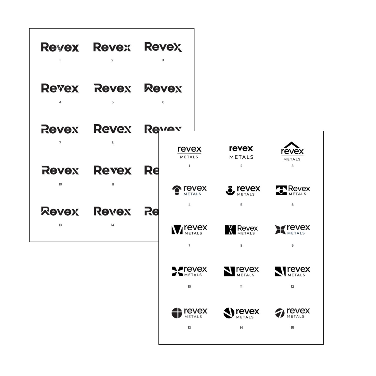
We began the logo process expanding on what we discussed during the naming process—building on our understanding of the Revex process, their competitors, and their industry. We explored logo marks and font styles after we analyzed the competitive landscape. Meredith pulled together a number of logo ideations and selected the strongest options to review with our Monte team. She then arranged and numbered the strongest concepts to review live with the Revex team.
Step 2: Logo Refinement
We met with the Revex team to reveal the logo concepts in a meeting. We then shared the PDFs with the Revex team to analyze with family, friends, and business colleagues before selecting the top logo.
Establishing a Brand
When you establish a strong brand, your colors, typography, and visual elements all convey your company's expertise and values. Through brand consistency, you can establish your company as a trusted authority in your field. We were striving for simplicity with the brand - to create a memorable concept that could easily be recalled by their audience. The font selected for the Revex brand gives a nod to their team's innovation, while providing a subtle strong and reliable stance. The fonts shown to the Revex team were all carefully selected to accompany the logo in tone and brand presence, while also being web safe.

Step 3: Logo Color
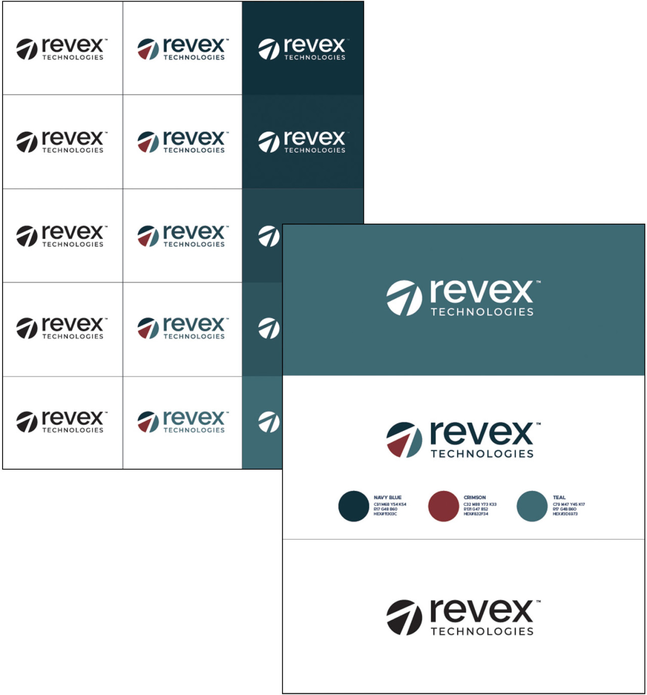
After the final logo was selected, refined, and finalized, we set to work on color. We created a variety of color options that focused on the client's preference toward the maroon, teal, and blue color families. The colors balance authority, innovation, and professionalism. The colors, when combined, evoke the feeling of reliability and trust. The hand-crafted color palette has helped Revex stand apart with a strong and recognizable brand. We iterated in meetings and by email before wrapping up the project by saving the final files in a range of formats the Revex team would need, including .ai, .eps, .pdf, .jpg, and .png. After the name and logo were finalized, our team collaborated with the Revex team to complete the brand story across powerpoint presentations, data visualization and graphics, photography, and videography—culminating with the website.


