Fast. Easy. 100% hands-free.
The idea behind Viya's automatic glove dispenser is brilliant in its ease—select your size, insert your hands, and you are gloved and ready to go! After Matt and Ashley helped name this revolutionary product Viya, Lauren designed a deceptively simple logo that shows gloved fingers coming out of "automatic" copper rings. Because the inventors are from Michigan's Copper Country, all of the brand elements combine perfectly to form the Viya logo.

Concept Creation
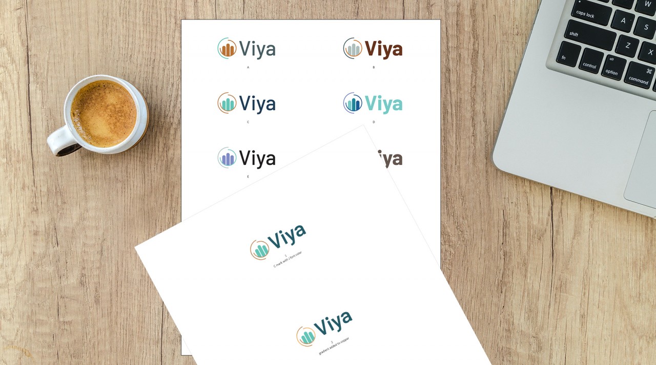
After soaking in everything she could regarding the product, its key selling points, and the competitive landscape, Lauren designed two pages of black and white logo concepts. We reviewed these concepts live with the client and discussed the meaning of each. Once they chose their favorite logo, we refined the design before moving to the next phase—color.

Touch of Color
Lauren tried a wide range of color palettes before the client selected a teal and copper combination. The teal green closely links to the medical industry and the copper rings imply cleanliness through the natural properties of copper. The subtle gradients in the copper rings add a bit of shine and dimension to draw attention to the implied automatic nature of Viya.


