We build brands—one logo, brochure, and website at a time.
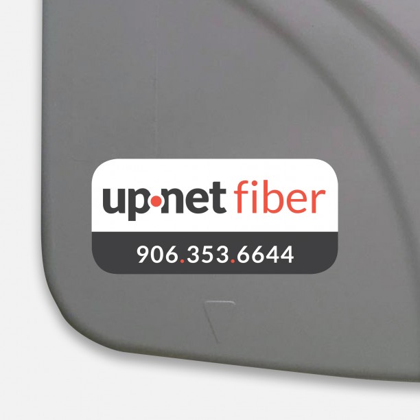
up.net had a brand problem. Some of their customers knew them by their old name (Baraga Telephone) but the future of the business depended on incorporating services far beyond telephone. The MONTE team designed the new up.net logo and then built a brand around it over time.

LOGO DESIGN
Although up.net came to our team for a website, but we expressed our concerns about the effect their dual-branding had on their customers. We began the project by exploring ways to bring the two entities under one cohesive brand – up.net. Lauren analyzed their existing logo with the large circle and a serif font and worked with those elements to create a simpler and cleaner logo, repositioning the circle between the up and net to represent both the dot and provide an easy to remember branding element.

ADVERTISEMENT DESIGN
During our rebranding efforts, up.net expanded their fiber internet services to specific areas in the city of Houghton. They were looking for a way to educate residents in those areas about fiber internet and the differences they might experience from shared cable services. The door hanger also worked to explain options residents have to move to fiber internet and ditch their cable connection entirely – from streaming services to devices and antennas. The campaign served as an educational tool to help residents understand the freedom of fiber internet.
Let's talk about ways to engage your audience

SIGN DESIGN
Once the logo was finalized, up.net worked with Lauren to redesign their building signage for their L’Anse, Baraga, Chassell, and Crystal Falls locations. Several of the offices also have created welcome walls with a pop of up.net branding for their customer facing sections, all built and installed by Elite Signs in Chassell. To accompany their new brand, Lauren also updated the badges up.net technicians use and created new business cards.


Building a strong brand hinges on maintaining brand consistency.
Brand consistency... what does that mean? Think about every place someone might encounter your logo, products, or services. From your packaging design and signage to your social media posts and the shirts you buy for your employees.
Do the designs vary from use to use? Or do you use the same logo, design elements, colors, and typefaces on everything you create? Defining what is and isn't acceptable for a brand is one of Lauren's favorite things to do. In fact, she can even create a brand identity guide that makes it easy to "stay within the lines."
CASE STUDY: Finlandia University