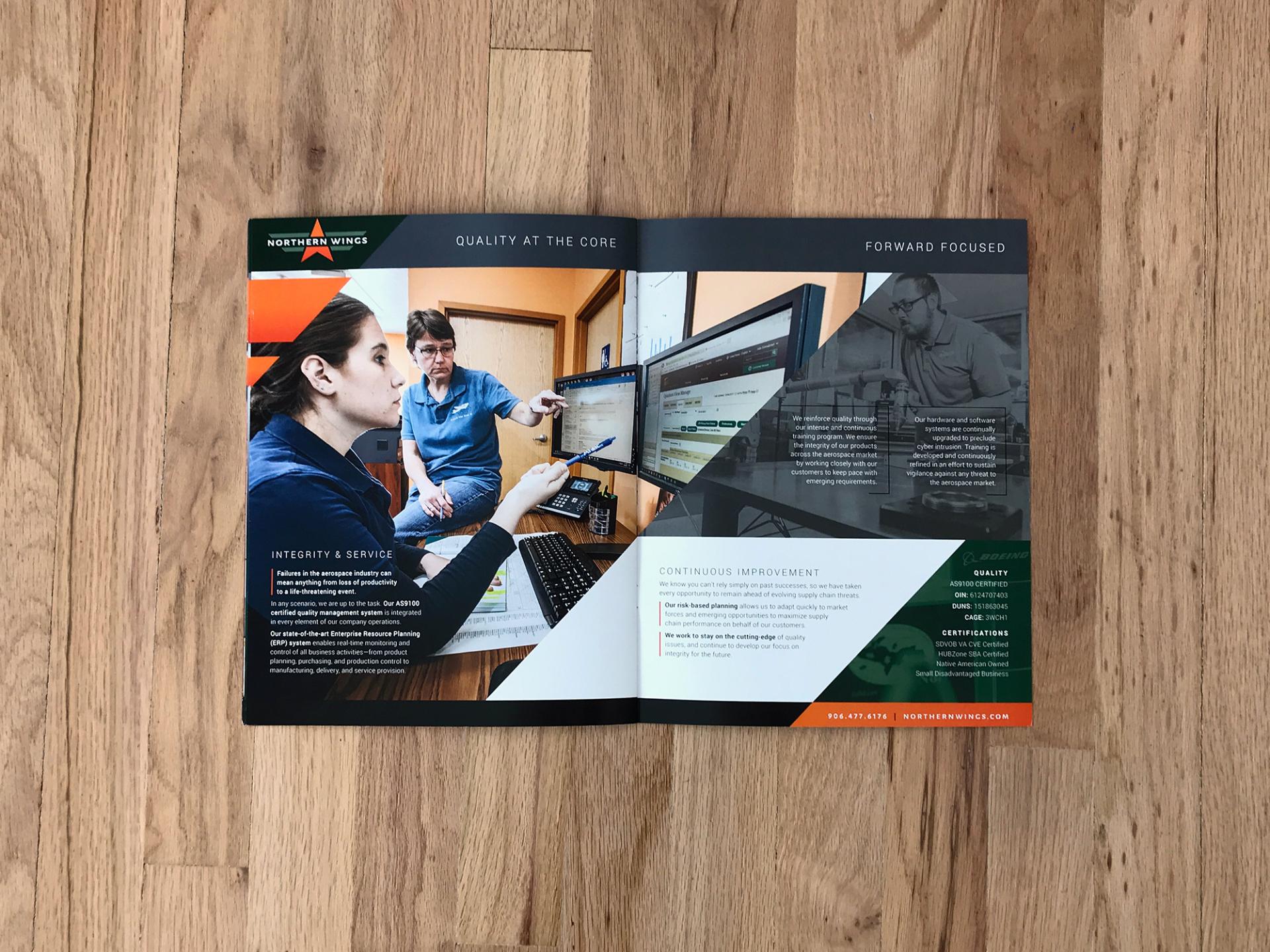
Northern Wings selected Monte for a complete rebranding project. It has gone flawlessly. They coordinate, control and escort the process from start to finish. Monte was quick to define where we’ve been, where we are and where we want to go—and then took us there with aerospace precision! Our corporate message is now directed, defined and clear. We should have hired them years ago.

Built to Stand Out
We translated the Northern Wings brand into a flexible tradeshow system designed to communicate capabilities quickly.
From large backdrops and retractable banners to table graphics and supporting materials, each piece uses bold imagery, clear messaging, and consistent branding to help Northern Wings look polished and recognizable in a crowded exhibit hall.
Northern Wings Logo
industrial
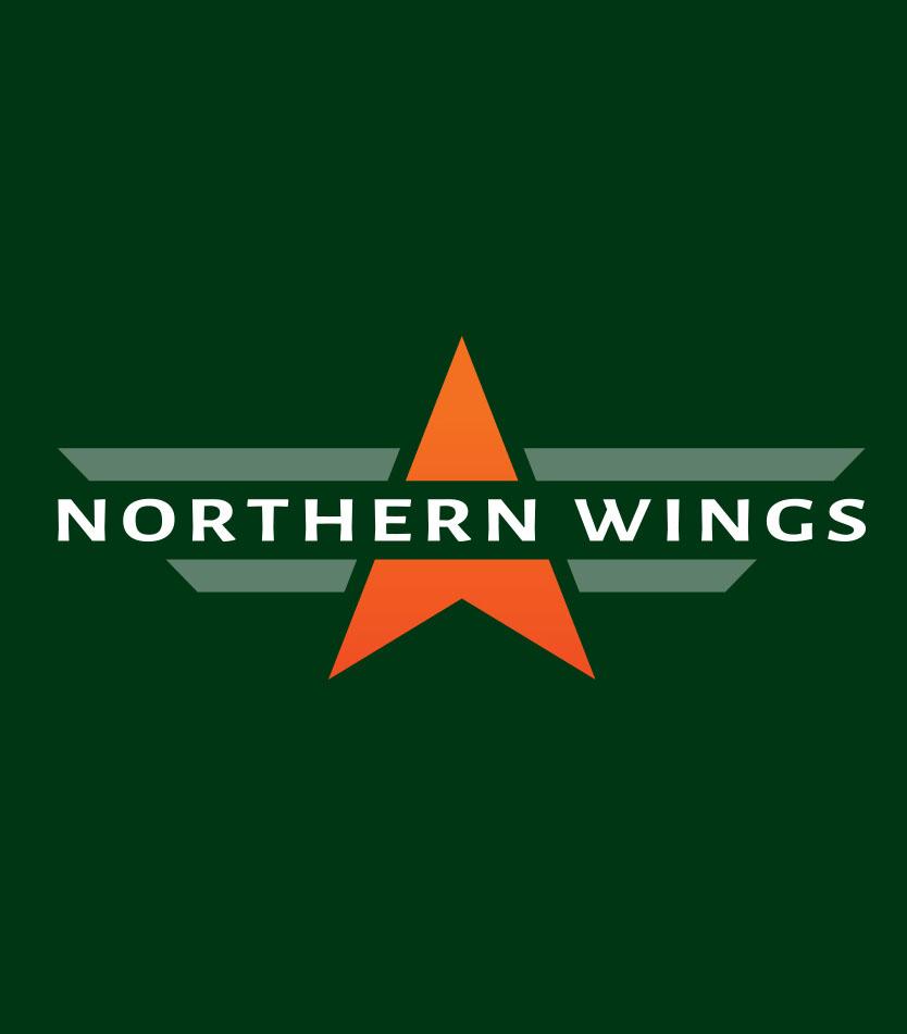
We simplified Northern Wings’ logo into a cleaner, stronger mark with a clear aerospace connection and greater visual impact.
BEFORE
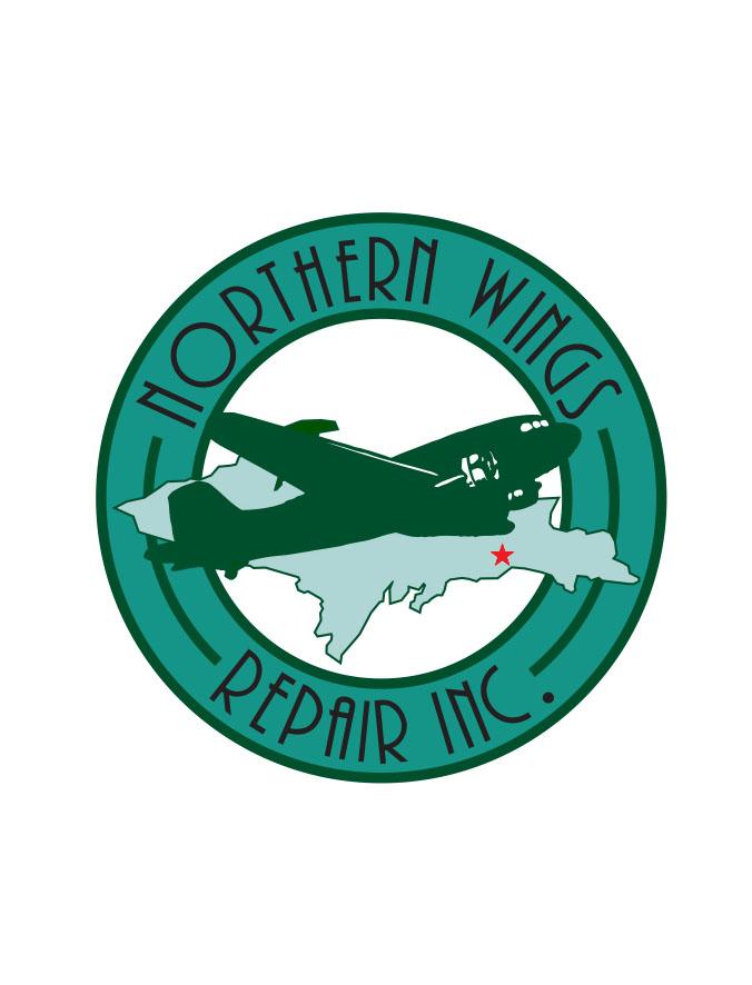
AFTER
Brand Unity
The best logo in the world would be powerless without a unified supporting cast. In this case, Lauren implemented the brand across a range of materials, including business cards, letterhead, envelope, PPT template, flyer, brochure, website, and tradeshow backdrops.